LightStream's Design System

A scalable UI framework and governance model for a growing fintech platform

LightStream's Design System

A scalable UI framework and governance model for a growing fintech platform

Overview

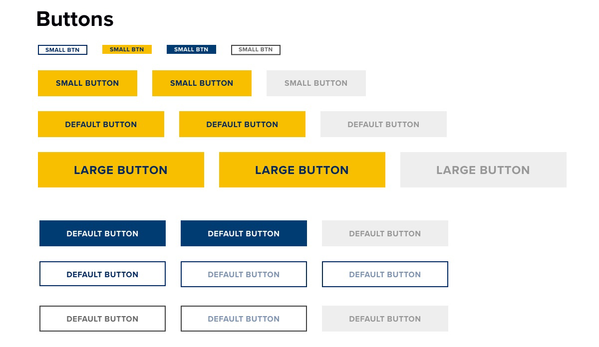
When I worked on this project, LightStream's marketing site and loan application didn’t share a single visual language. The palette didn’t meet WCAG 2.1 AA requirements, nor did it follow best-practice UI patterns. The team of designers and third-party vendors was redrawing the same primary button in five shades of blue, and engineers were guessing which one was correct.

My main goal was to build a single source of truth by creating a design system squad, auditing the platform's fragmented UI, structuring it using a five-stage atomic design methodology, and establishing governance that led engineering and business stakeholders to adopt it as the company's standard for building digital lending products. This case study walks through the fragmentation I inherited, the system I built, and what made it stick.

Information

Client

LightStream, Division of Truist Brank

Role

Lead UX & Visual Designer, Design System Product Owner

Industry

Fintech - Digital Lending Application

The Problem

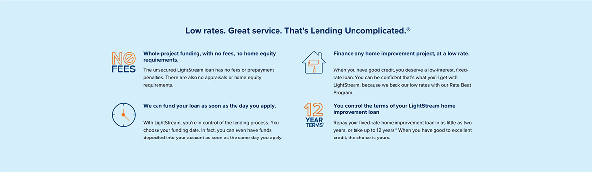
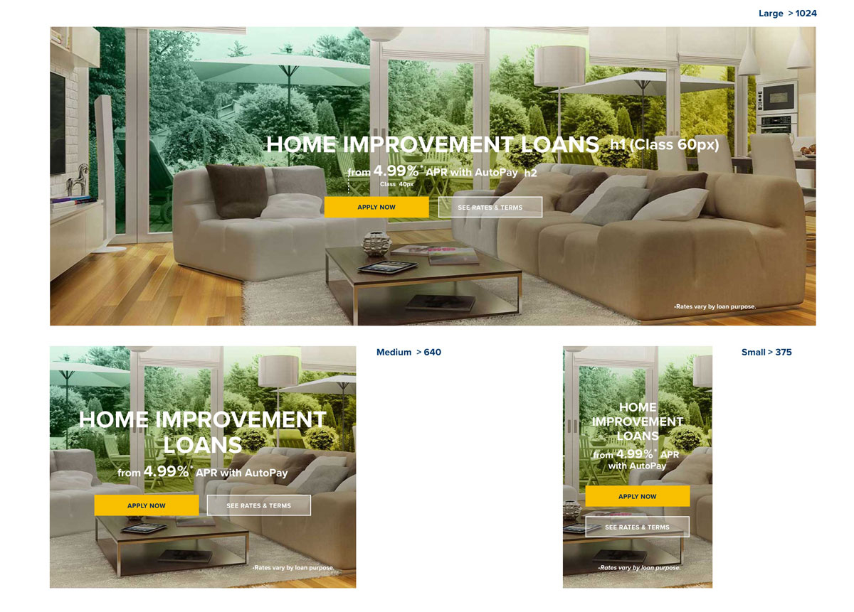
LightStream inicial webpage for home Improvement
LightStream offers loans for almost anything: debt consolidation, home improvement, and auto refinancing. Its digital footprint had grown just as broadly. Marketing pages, product pages, and the loan application itself evolved on separate timelines, built by different teams working from different assumptions about what a primary button or a form field should look like.

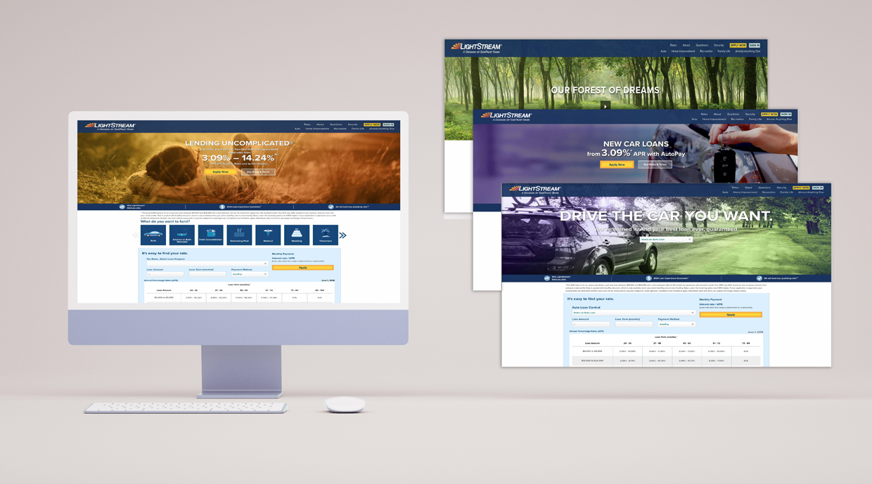
The result was a platform that felt like several products stitched together. A user could move from a polished marketing page into an application flow that looked, behaved, and felt like a different brand.

Internally, designers redrew the same components from scratch every time. Engineers wrote one-off CSS instead of reusing code. Every new feature meant renegotiating decisions that should have already been settled.

Role & Team

I owned this program end-to-end as both lead designer and product owner for the design system squad. That meant setting the design direction, including color, typography, components, and patterns, and running the cross-functional process that got engineering, marketing, and business stakeholders to actually use it.

I partnered directly with front-end engineering on implementation and led bi-weekly working sessions that turned the system from a design deliverable into a shared standard.

Process & Research

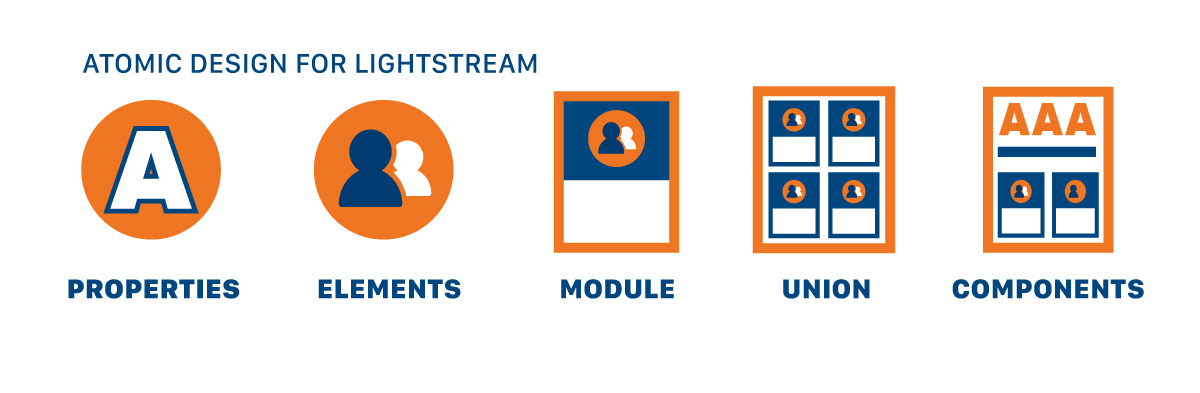
The five-stage atomic design methodology used to structure LightStream's system, from raw properties to production-ready components.
I started where every reliable system starts: an honest inventory. Before proposing a new color or component, I audited every button, icon, font, color, form, and field across the marketing site and the loan application experience. Nothing was assumed correct simply because it already existed in production.

From there, the work moved through five deliberate stages, structured around atomic design principles:
  • Properties: the raw values, color, type, spacing, and other foundational tokens.
  • Elements: individual UI pieces built from those properties, such as buttons, icons, and inputs.
  • Modules: elements combined into functional units, like a complete form field with its label, input, and validation state.
  • Union: modules assembled into templates, page layouts, CMS structures, and reusable page-level patterns.
  • Components: the fully realized, production-ready pieces that design and engineering could both point to as the single, agreed version of truth.
Every element that survived the audit was evaluated against five guiding principles: consistency, self-containment, reusability, accessibility, and robustness. Color pairings were verified against WCAG 2.1 AA contrast requirements before anything was finalized. Naming conventions were standardized so that a developer and a designer looking at the same component would refer to it by the same name.

Getting to Adoption

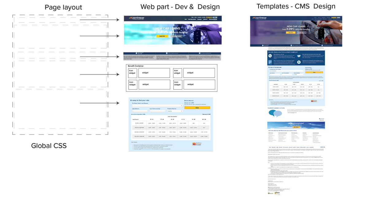
Shared page layout, reusable web parts, and CMS templates, the union-level patterns that let marketing and product teams build from the same parts.
A system nobody uses is not a system; it is a document. I saw that risk early and treated rollout with the same rigor as the design work. As product owner for the design system squad, I ran bi-weekly sessions with engineering to build a shared understanding that a brand is not just a logo and a color palette, but a set of decisions made in every interaction.

That was a harder sell than the visual work. Developers initially treated the system as a design team deliverable, something to reference rather than something they had a stake in. The sessions changed that. Developers who once saw the system as someone else's document started joining decisions about forms, typography, and interaction behavior. I incorporated their feedback directly into the guidance because a design-systems engineering approach did not help identify what would not survive a real sprint.

The output was a documented, internally hosted system that covered global CSS and page layout, reusable web parts for development and design, and CMS templates, enabling a marketing page and a loan application screen to be assembled from the same underlying parts.

The Solution

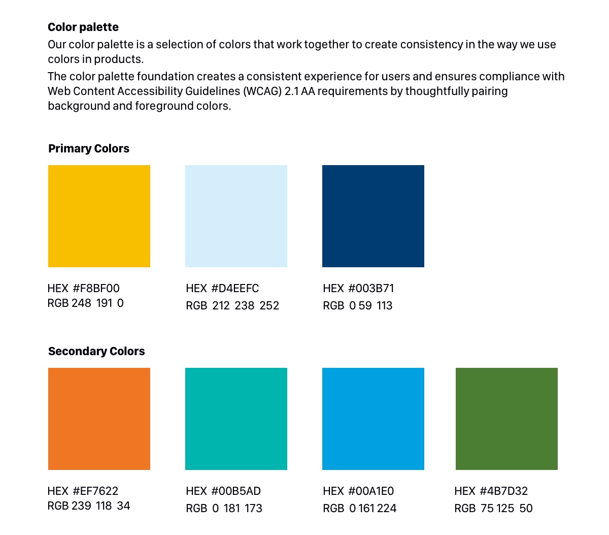
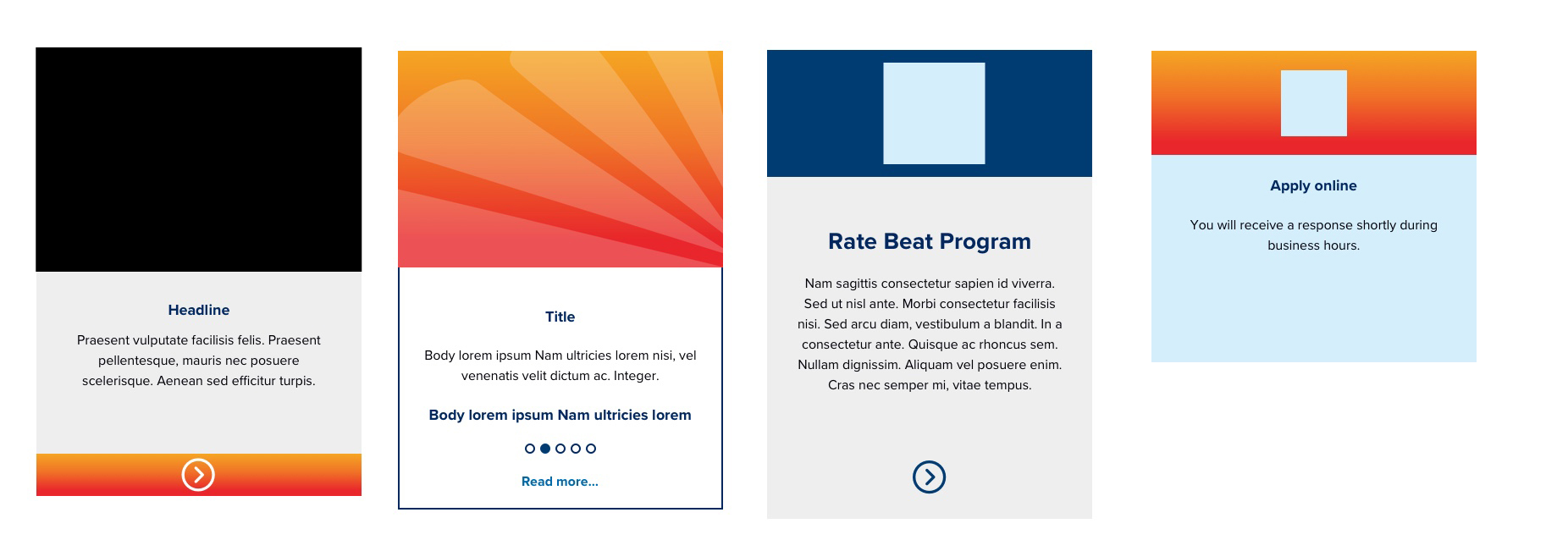
The solution was a documented, internally hosted design system with Storybook that provided LightStream with a single source of truth for design and engineering. It included a compliance-first color system, reusable web parts, CMS templates, global CSS, page layout guidance, form patterns, naming conventions, and a five-stage component structure, so marketing pages, product pages, and the loan application could all be built from the same underlying parts.
The system changed how teams worked. Designers no longer rebuilt the same button in different shades of blue, engineers stopped writing new CSS for existing patterns, and new features no longer required repeated negotiations over brand standards. Accessibility was built into the palette rather than treated as a separate audit, with color pairings verified against WCAG 2.1 AA requirements for background and foreground use.

The outcome was a scalable foundation for LightStream’s digital lending experience. Marketing pages and loan application screens now share one visual language, component set, and color system. 
Forms, fields, and interaction patterns follow consistent naming conventions across teams, reducing handoff friction and making the system both a practical build resource and an educational reference.

For a Lead Designer role, this project shows the value I bring: bridging visual craft and systems strategy, owning a program from research through rollout, and building infrastructure that enables confident, consistent design and delivery.

Reflection

Marketing and loan application screens now share one visual language, color system, and component set.
If I reconsidered this process, I would implement a lightweight adoption metric from the start, such as tracking how many new features use existing components versus new ones, rather than relying on the qualitative signal of what ceased to happen. I would also introduce the bi-weekly engineering sessions earlier. These sessions proved crucial in making the system stick, and starting them during the audit phase—before the first version was built—could have shortened the path to true adoption.

Equally important, the system gained genuine buy-in. What began as a design initiative became cross-functional, with senior stakeholders and developers anticipating each new guideline rather than simply complying. This shift from mandate to momentum signals that the system was designed to endure beyond any single project.