Web Design Education Resources 

Turning a page, visitors abandoned into one they could act on

Web Design Education Resources 

Turning a page, visitors abandoned into one they could act on

Overview

Sixty-two percent of visitors left LightStream's About Us, Questions, and Rates & Terms pages before finding what they came for, a bounce rate high enough to place it at the top of the industry's benchmark for concern. After I led the redesign of those pages, that number dropped to 40%.

I served as VP, Visual and Experience Designer, on this project at LightStream, a division of Truist. I owned the visual brand identity, information architecture, and UI design, and worked closely with product and development to ship it. This is the story of how a page that was overwhelming, unclear, and repetitive became usable.
62%
BEFORE
Bounce rate on About Us, Questions, and Rates & Terms
40%
AFTER
Bounce rate after the redesign shipped

Information

Client

LigthStream, Division of Truist Bank

Role

Lead UX & Visual Designer, Design System Product Owner

Industry

Fintech - Digital Lending Application

Overview

Sixty-two percent of visitors left LightStream's About Us, Questions, and Rates & Terms pages before finding what they came for, a bounce rate high enough to place it at the top of the industry's benchmark for concern. After I led the redesign of those pages, that number dropped to 40%.

I served as VP, Visual and Experience Designer, on this project at LightStream, a division of Truist. I owned the visual brand identity, information architecture, and UI design, and worked closely with product and development to ship it. This is the story of how a page that was overwhelming, unclear, and repetitive became usable.
62%
BEFORE
Bounce rate on About Us, Questions, and Rates & Terms
40%
AFTER
Bounce rate after the redesign shipped

Information

Client

LigthStream, Division of Truist Bank

Role

Lead UX & Visual Designer, Design System Product Owner

Industry

Fintech - Digital Lending Application

The Problem

LightStream's product is simple: paperless loans for people with good to excellent credit, funded in as little as 24 hours. The pages explaining the product were not simple at all. When I investigated why About Us, Questions, and Rates & Terms were underperforming, three issues kept coming up.

Difficult to digest

A screenshot of the website for weststream.
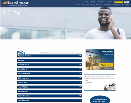
Dense FAQ page: content buried behind dropdowns
Too much information was crammed onto a single page, and much of it sat hidden behind accordions and dropdowns that a visitor had to already know to look for.

Confusion

A person sitting on a bench with a laptop.
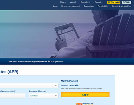
Rates page: benefit and CTA are disconnected from each other
The core benefit to the customer did not appear early enough, and when it did, it rarely included a clear next step. Someone could read the entire pitch and still not know what to click.

Repetitive information

A screenshot of the upstream website.
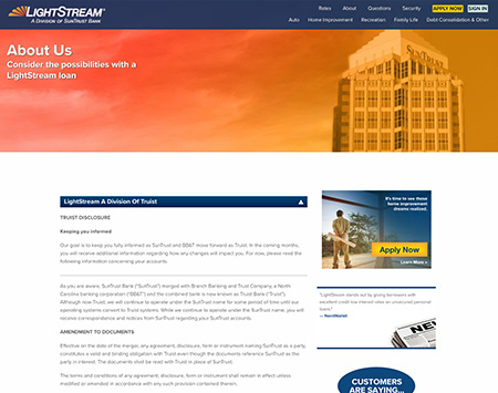
About page: content repeated from other pages
The same content was restated across multiple pages. That did not just frustrate visitors; it also undermined the site's SEO by splitting authority across pages competing for the same keywords.

Role & Team

As Lead of Visual and Experience Designer, I led the end-to-end redesign, owning the information architecture, wireframes, visual design system, and final UI. I partnered closely with product and development leads to ensure every decision was practical to build and used the project to run a full human-centered design process, rather than simply handing off finished screens at the end.

Process & Research

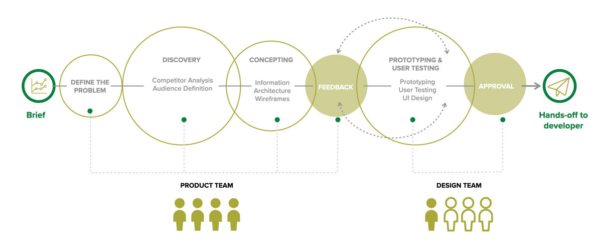
I anchored the work in a human-centered design process, moving from problem definition through discovery, concepting, prototyping, and testing to approval, with product and design checking in with each other at every stage instead of a single handoff at the finish line.

Human-centered design (HCD)

The human-centered design process I used to structure the project, from brief to developer hand-off
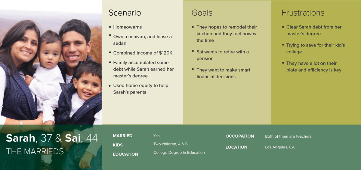
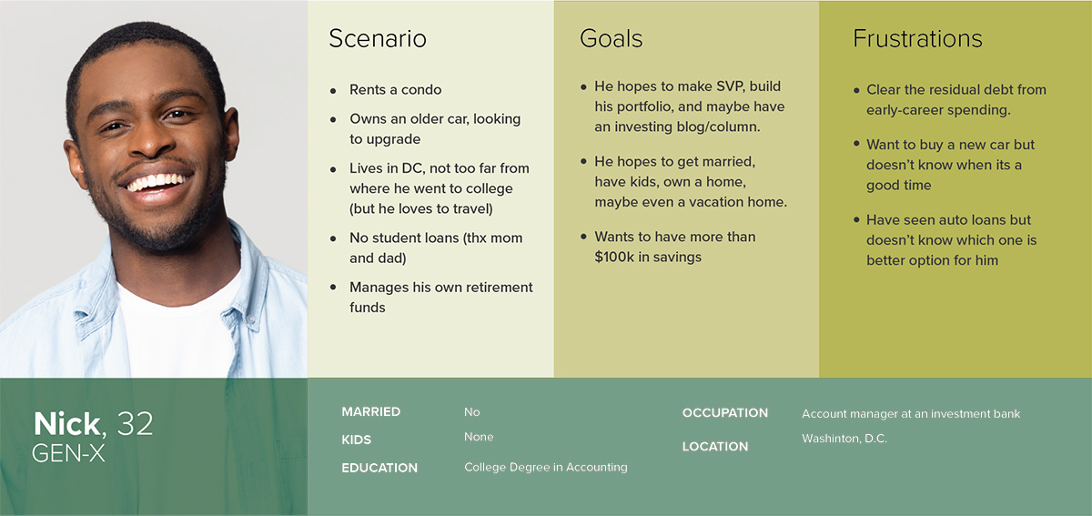
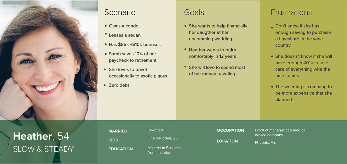
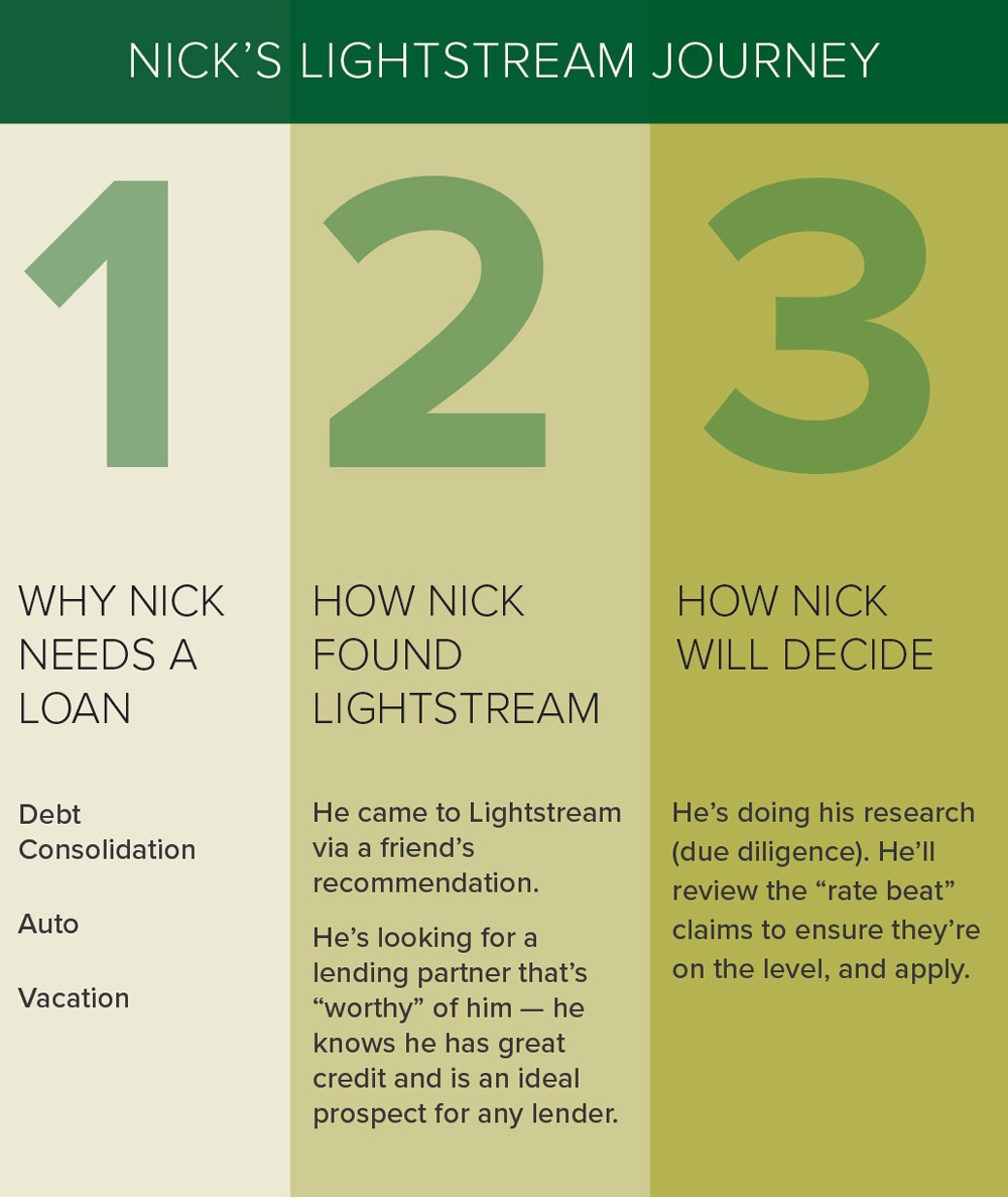
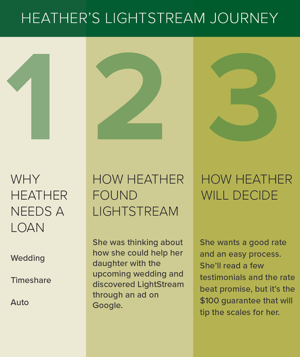
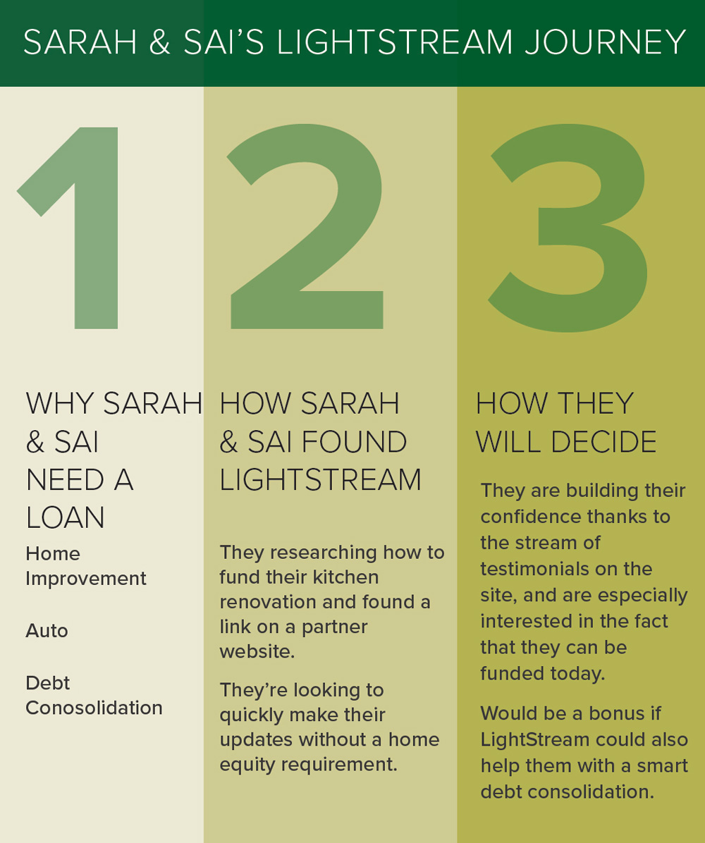
There wasn't budget for a full round of user research, and I stated this plainly in the project documentation rather than pretending otherwise. I built the audience definition from customer feedback and site data, then developed three personas, Nick, Heather, and Sarah & Sai, each representing a different reason people were landing on the education pages and a different reason they were leaving.
From there, I mapped each persona's journey across the existing pages to pinpoint exactly where friction occurred: where they got confused, where they gave up, and where the page failed to answer the question that brought them there. That mapping turned three vague complaints into a real design brief. It shifted from "the page is confusing" to "a visitor comparing rates hits a wall of legal language before they ever see the number they came for."

Design Iterations

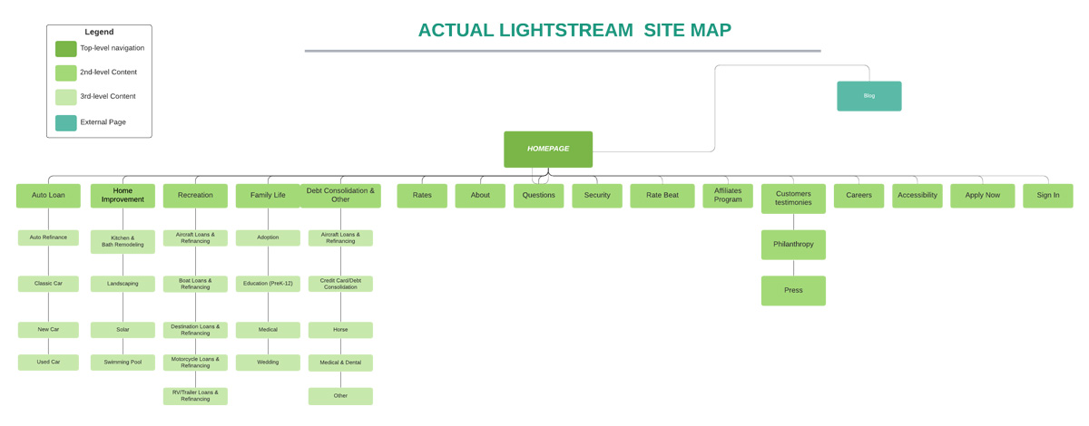
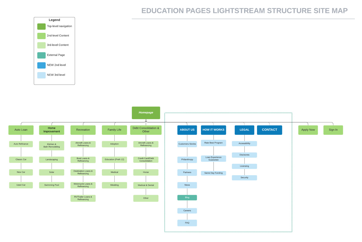
The site map was the biggest structural decision. The old structure was flat and inconsistent, with pages competing for attention instead of guiding visitors forward. I rebuilt it as a clear hierarchy: a landing page led to focused parent categories, each supported by relevant child pages. Visitors looking for home improvement loans no longer had to sort through content about auto loans, family loans, and debt consolidation on the same page.
Old site map: flat, competing pages
New site map: strict hierarchy of parent and child pages
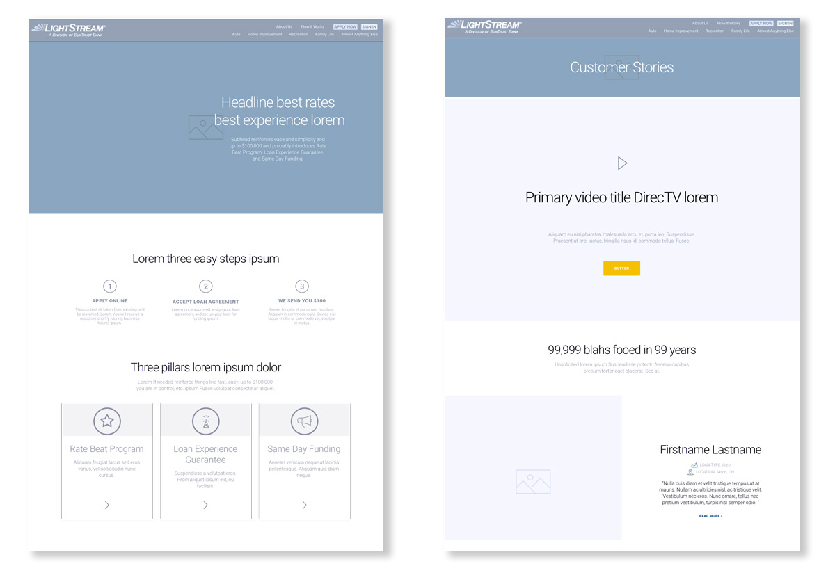
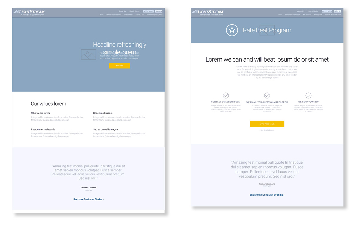
From the new structure, I moved into wireframes, deliberately keeping them low-fidelity so the team could agree on layout and content hierarchy before anyone got attached to a color or typeface. Once that structure was held up under review, I built out the design language, typography, color, iconography, and component rules, so every new page would feel consistent no matter which one a visitor landed on first.
Desktop wireframes
Content hierarchy wiframes
A series of four different types of newsletters.
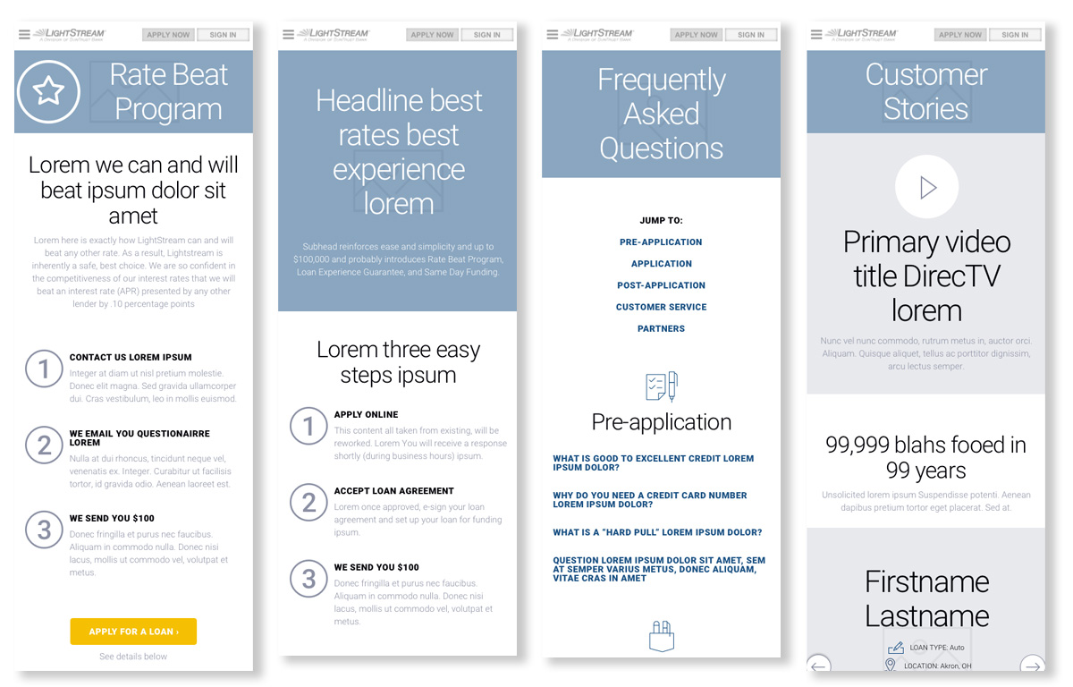
Mobile first wireframes

The solution

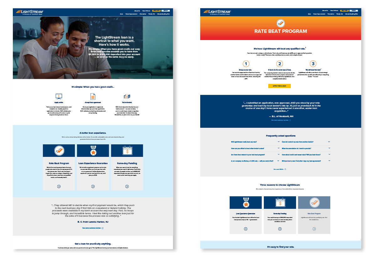
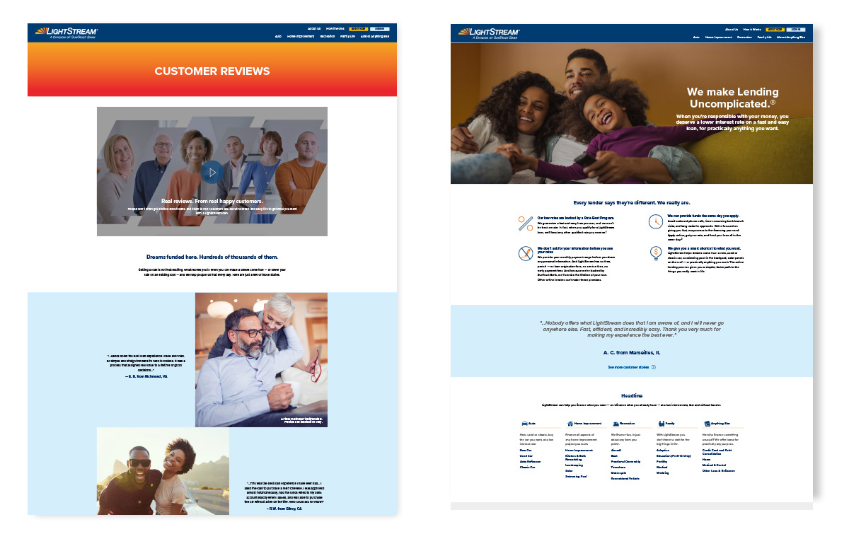
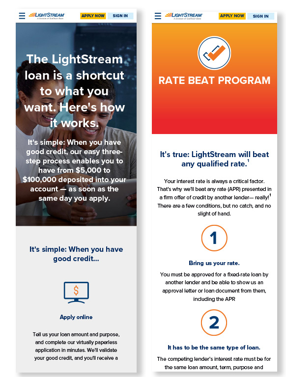
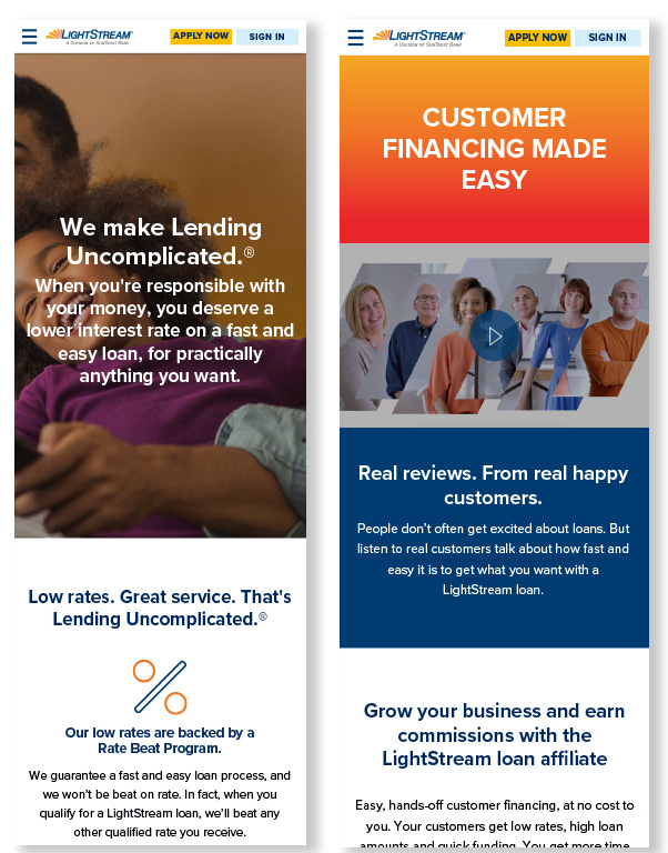
The shipped pages directly address each of the three original problems. Content is broken into scannable sections rather than a single dense page. The customer benefit appears immediately, with a clear call to action attached to it rather than floating. And information lives in one place instead of being restated across five pages.

Video of using the of new design system and components into the redesign

REFLECTION

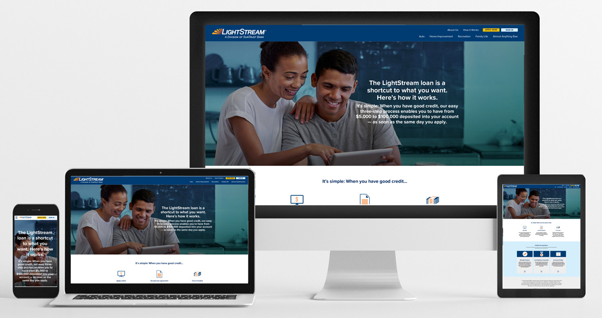
A desktop computer and tablet are on the same desk.
The redesign gave LightStream a clearer, more usable educational experience and produced a measurable shift in behavior: the bounce rate on the redesigned pages dropped from 62% to 40%, moving About Us, Questions, and Rates & Terms from the high end of the industry benchmark into a healthy range. Consolidating repeated content also cleaned up the pages’ search footprint and provided development with a reusable system for future educational content, rather than a one-off page.

If I could rerun this project, I would push harder to secure a round of moderated user testing before locking in the personas. Data and customer feedback got us close, but nothing replaces watching a real person hit the exact wall you are trying to design around. I would also instrument the new pages more tightly from day one, so the bounce rate improvement could sit alongside funnel and engagement data instead of standing alone as the headline number.

What I am proudest of is the process itself: turning a vague complaint, these pages are not converting, into a specific, testable hypothesis about where and why people were leaving, then building a system flexible enough that the product could keep extending it long after I handed it off.