Essentia Health Website Redesign & Design System

Turning a healthcare system's first responsive redesign into a reusable, accessible design language.

Essentia Health Website Redesign & Design System

Turning a healthcare system's first responsive redesign into a reusable, accessible design language.

OVERVIEW

Essentia Health asked Perficient to rebuild its public website on Sitecore: faster to update, responsive across devices, and built around what patients need to do, such as finding a doctor, understanding a service line, or booking an appointment without picking up the phone. I joined as the senior visual designer on a five-person team, tasked with taking the discovery team's early wireframes and rough color direction and turning them into a full, accessible design system built on Semantic UI.

That system became the foundation for every template that shipped, including a physician directory that now surfaces more than 2,100 physicians and advanced practitioners. 
Information

Client

Perficient, for Essentia Health

Role

Lead UX/UI Consultant, Visual Designer

Industry

Healthcare

The Problem

Healthcare websites carry a particular kind of pressure. People arrive stressed, often searching for a specialist, a diagnosis explanation, or a location near a sick family member, and a confusing or inconsistent interface adds friction at exactly the wrong moment. Essentia Health's existing site was not responsive, and its visual language shifted enough from page to page that maintaining it meant nearly rebuilding it every time a new template or service line was added.

The discovery team had already produced low-fidelity wireframes and a rough color direction, but neither was ready for production. Perficient needed someone to close that gap: turn early concepts into a real, reusable system that engineering could build in Sitecore, and that Essentia's own team could maintain long after our contract ended.
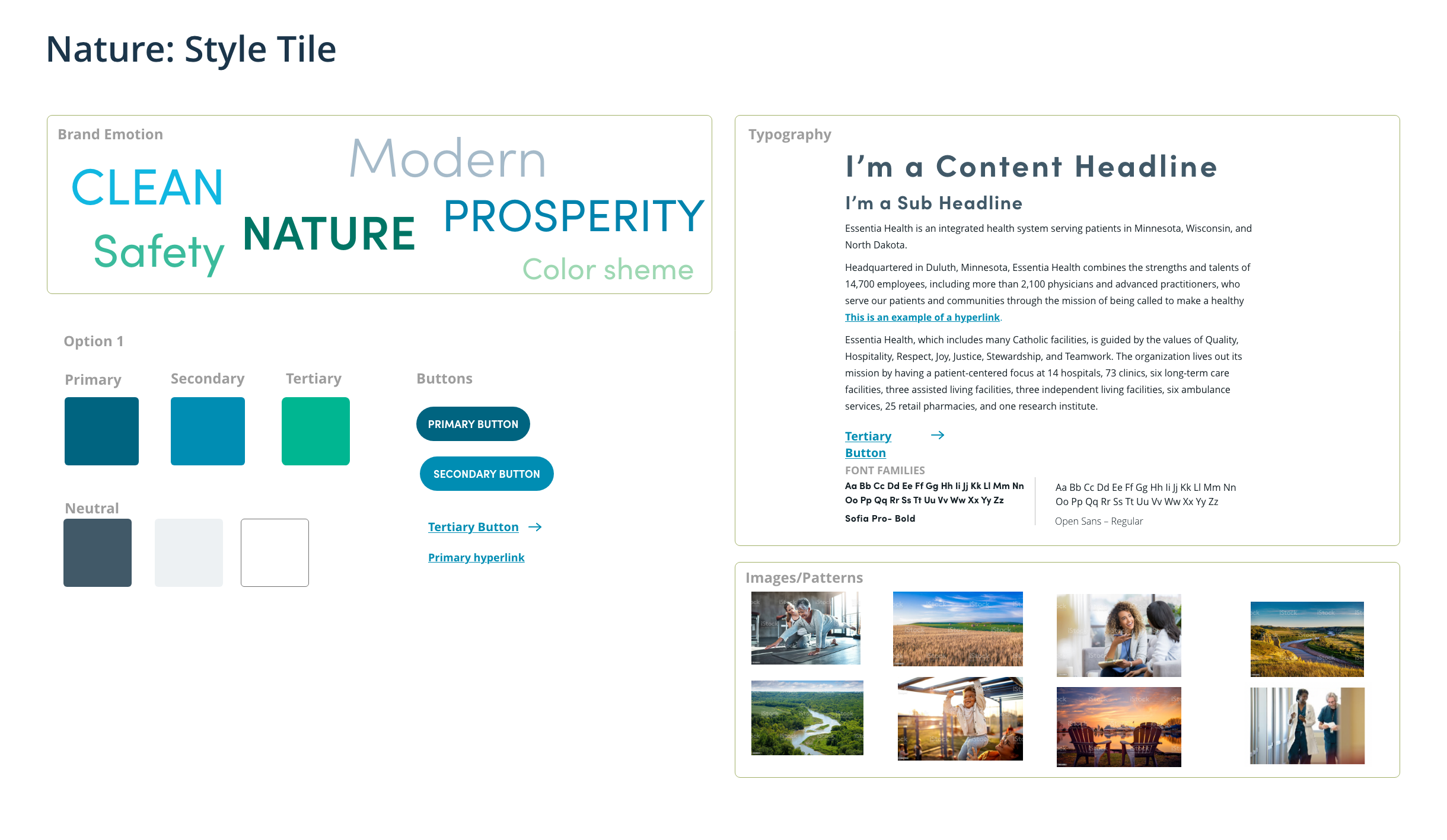
An early style tile exploring tone, color direction, and imagery before any component was built.

Role & Team

I worked on a five-person core team: a project manager, an art director, an information architect, a copywriter, and me as the senior visual designer. Content strategy and page structure stemmed from the information architect's upstream work; my scope was the visual and interaction design, from moodboards through final component specs, and the design system that tied it together. Once we had stakeholder sign-off, our team handed the full system and page specs to development and engineering, who rebuilt the CMS and front-end framework in Sitecore.

The full engagement ran about a year from kickoff to launch. The design and design-system phase I led took roughly six to eight weeks of that timeline, front-loaded so engineering had a stable spec to build against for the rest of the program. 

Process & Research

I started with moodboards, not mockups. Essentia's brand line is “People Like Nowhere Else,” and before touching a single component, I needed to determine whether the interface should feel clinical and calm or warm and human. I pulled reference imagery and typography directions into a few style tiles and walked stakeholders through the trade-offs of each before committing to pixels.
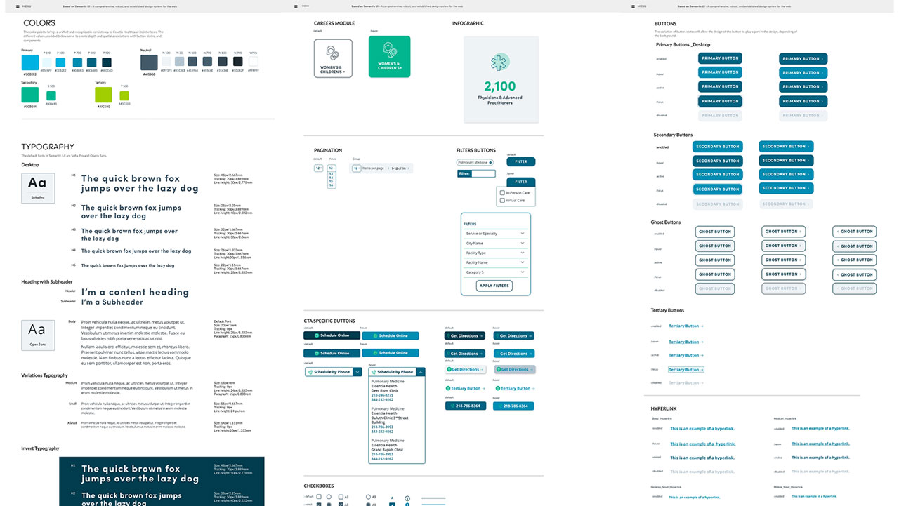
The rebuilt color and typography foundations: an accessible token scale instead of standalone brand swatches.
The real problem surfaced when I tried to apply the discovery team's color direction at UI scale. Their palette worked as a brand mood board, with greens and teals meant to read as clean, natural, and reassuring, but it was not built for interface use. Applied to buttons, form states, and alerts, several combinations fell short of accessible contrast, which matters more in healthcare than almost anywhere else. These are pages where a disabled state, an error message, or a required field has to be unmistakable to a patient scheduling something as consequential as a cancer care appointment.
Nielsen Norman Group's guidance on color and contrast makes the same point: color can support meaning, but it can never be the only signal, and it has to hold up for people with low vision.

I rebuilt the palette as a proper token scale rather than a handful of brand swatches: a five-step primary blue, a secondary teal, a tertiary green, and a seven-step neutral gray scale, each checked for contrast in the states where it would actually be used. Typography followed the same logic, with Sofia Pro for headings and Open Sans for body text, a full-size scale, and a separate inverse treatment built specifically for dark backgrounds, since several templates use dark section backgrounds and needed body text that stayed readable there.

Stakeholders reviewed a few full design directions before converging on one, and that sign-off became the base spec for everything downstream, not just the homepage, but the pattern library engineering would use to build every future page without redesigning it from zero.

The Solution

The deliverable was not a set of polished screens. It was a component-based design system, built on Semantic UI as a foundation, that gave Essentia's team a shared language for every future page:
  • Foundations: the token color scale, typography scale, icon set, elevation and shadow styles, and grid system.
  • Core components: buttons (primary, secondary, ghost, and tertiary, each with enabled, hover, active, focus, and disabled states), inputs, cards, toggles, checkboxes, radio buttons, image holders, and modals.
  • Task-specific patterns: a filters panel (service or specialty, city, facility type, facility name), pagination, a careers module, and an infographic module for surfacing credibility stats.
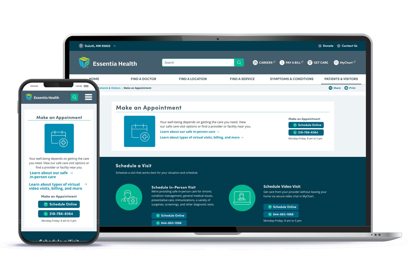
  • Conversion-focused CTAs built around how patients actually take action: Schedule Online, Schedule by Phone (which expands to the right clinic's direct number), and Get Directions.
Find a Doctor, built on the filters and pagination patterns, and a location page showing a live estimated wait time.
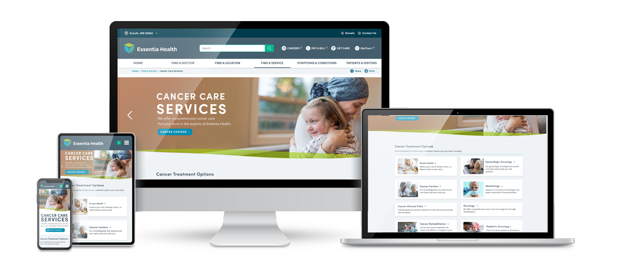
Those pieces came together across the templates that shipped: the homepage, service-line pages like Cancer Care Services, a Find a Doctor search and filter experience covering thousands of providers, individual physician profiles with bios, video, and patient reviews, and location pages that surface a live estimated wait time, a small detail that does real work in reducing anxiety for someone walking in for care.Every template was responsive by default, since the components were built once at the system level rather than adjusted per breakpoint on a per-page basis.

Outcome & Impact

The system shipped and is live at essentiahealth.org. Concretely:
  • A single design system now powers the entire site, from the homepage to a Find a Doctor directory covering more than 2,100 physicians and advanced practitioners, replacing page-by-page visual decisions.
  • Usability testing after launch validated that the templates read as professional, pleasant, and clean to the people actually using them, not just to the design team.
  • Because every button, card, and form pattern was built once with documented states, Essentia's internal team can ship a new service-line page or location profile without a designer redesigning the pattern from scratch, which was the point of building a system instead of a one-off redesign.
  • The six-to-eight-week design phase gave engineering a stable, fully specified system to build against for the remaining months of the program, rather than a moving target.
Cancer Care Services, one of the service-line templates built on the shared component system, shown responsive across breakpoints.

Reflection

To achieve a cohesive and visually appealing experience, we unified the visual language across the entire site. By creating a consistent design approach, we ensured that users could navigate the platform intuitively without confusion. The development of UI kits in a design system format further supported this effort.

These kits provided reusable components and design elements that can be easily applied throughout the site, ensuring consistency while allowing for flexibility in design updates. This structure not only simplifies the design process for future enhancements but also aligns with best practices in web development, making it easier for the Essentia Health team to maintain and update the site over time.