Boost Mobile E-commerce Web Design

Building one flexible design system to run four wireless brands without losing what makes each one distinct.

Boost Mobile E-commerce Web Design

Building one flexible design system to run four wireless brands without losing what makes each one distinct.

Overview

Dish Network's retail wireless division was growing fast, while its digital presence struggled to keep up. Four brands, Boost Mobile, Boost Infinite, Project Genesis, and Republic Wireless, were each being designed and built from a different set of assets, tools, and documentation. As Lead UX/UI Consultant on the Perficient engagement, I led the design and rollout of a global, token-based design system that gave every brand its own visual identity while running on one shared foundation.

Within the first year, the system consolidated three disconnected documentation and build sources into a single Figma library used by designers, content authors, and developers, then extended into billing and checkout flows across the Adobe Experience Manager and Magento stack that powers the site's transactional pages.

Information

Client

Dish Network, Retail Wireless Division (Boost Mobile), engaged through Perficient.

Role

Lead UX/UI Consultant, Visual Designer

Industry

Telecommunications, E-commerce Retail

THE PROBLEM

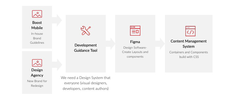
Mapping the three disconnected sources feeding the live site: in-house tools, a development guidance tool, and the content management system, each with its own version of the same components.
Three teams were building the same retail wireless experience using three different toolkits: an in-house marketing team maintaining brand guidelines in a single system, a content management team building components directly in AEM containers with custom CSS, and an external agency introducing a new visual identity for one of the four brands. None of the three had visibility into what the others were shipping.

The result was what Nielsen Norman Group calls a break in the consistency and standards heuristic: users encountered different button styles, spacing, and interaction patterns depending on which part of the site they landed on. Frontend developers could not build or test a component in isolation without first determining which version was current. Every new page meant re-deriving styles from scratch, which slowed releases and quietly multiplied the number of near-duplicate components in production.

For a business selling prepaid wireless plans through comparison-heavy pages (rate plans, device bundles, checkout), that inconsistency was not just cosmetic. It made the brand feel less trustworthy at the exact moment when a shopper is deciding whether to hand over payment information.

Role & Team

I joined the Perficient team as a Lead UX/UI Consultant and Visual Designer supporting Dish Network's retail wireless division. My work sat at the intersection of design and governance: I led the audit of the three fragmented sources, defined the token structure and component architecture in Figma, built the global and brand-specific component libraries, and wrote Frontend implementation documentation that enabled the new development team to build and test components independently.

I worked cross-functionally with the in-house marketing team, the content management (AEM/Magento) team, and the external branding agency, aligning all three around a shared set of standards rather than any single team's preferences. Adoption was as much a part of the job as the design work itself: documenting usage decisions, presenting component rationale, and helping other designers and developers understand not only what the system contained but also why it was structured that way.

Process & Research

Before designing anything, I needed to understand where the inconsistency was coming from. That meant sitting with all three sources at once: the in-house marketing team's brand guidelines, the CMS team's component builds, and the external agency's new brand direction for one of the four sub-brands. I mapped how each group's tools, from design software to the CMS's container-based CSS, fed into the live site, and ran usability testing on the existing site to see where the inconsistency was costing users time or confidence.

That mapping exercise surfaced the real issue: this was not a documentation problem; it was a structural one. Each brand legitimately needed its own visual identity, but the underlying interaction patterns, such as a plan-selector card, a form input, and a modal, were functionally identical across all four. Treating each brand as a separate design project just meant developers kept rebuilding the same component four times.
Solution problem for dish
Reframing the goal: one shared source of truth that every brand and every discipline- design, content, and development- could work from.
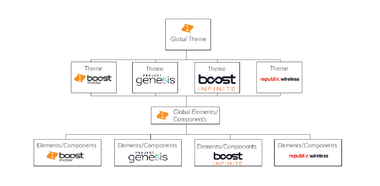
That insight reframed the goal. Instead of a single static style guide, I designed a tiered, token-based architecture: a global theme at the top, four brand themes beneath it, and a shared elements-and-components layer that each brand theme could draw from and extend. It follows the same logic as atomic design and the layered token systems Nielsen Norman Group recommends for multi-brand products: change a token once at the top of the hierarchy, and it propagates everywhere it is used, rather than requiring four manual updates.
The brand hierarchy: one global theme governing Boost Mobile, Boost Infinite, Project Genesis, and Republic Wireless, each inheriting from a shared elements and components layer.

THE SOLUTION

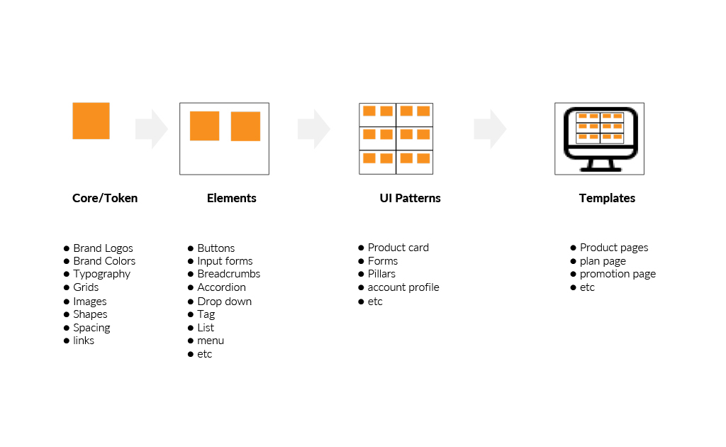
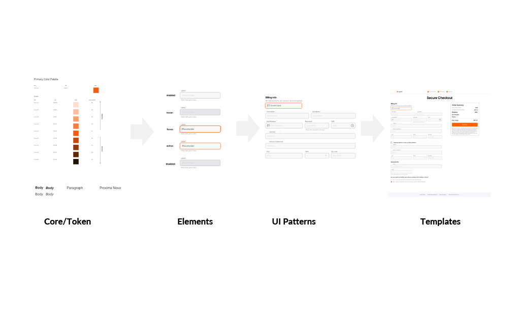
I built the system in four layers, moving from the most abstract to the most concrete: core tokens (color, type, spacing, grid), elements (buttons, inputs, icons), UI patterns (cards, forms, accordions, navigation), and templates (full-page types like plan pages and account profiles). Figma's variation mode let me activate the right brand's tokens against the same component set, rather than maintaining four parallel files. A button became one component with four possible skins rather than four separate buttons.
Core tokens, elements, UI patterns, and templates, the four layers the system is built from, shown alongside the annotated wireframe version used for developer handoff.
On top of the shared foundation, each brand, including Boost Mobile, Boost Infinite, Project Genesis, and Republic Wireless, maintained its own theme file containing the handful of components unique to that brand. That structure allowed the system to uphold Jakob Nielsen's consistency and standards heuristic internally (one button behaves the same way everywhere) while still giving each brand room to look and feel distinct externally.
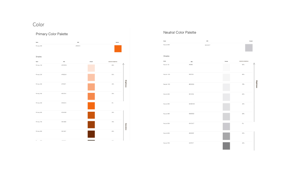
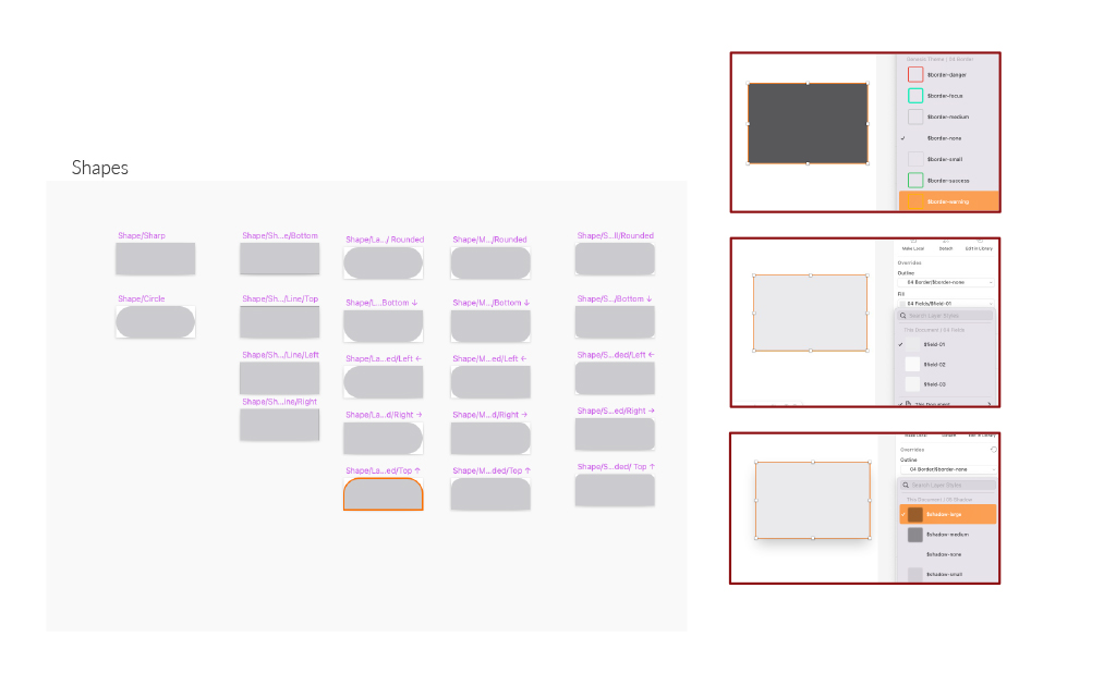
Primary and neutral color tokens and the UI pattern library built on top of them, documented for reuse across all four brand themes.
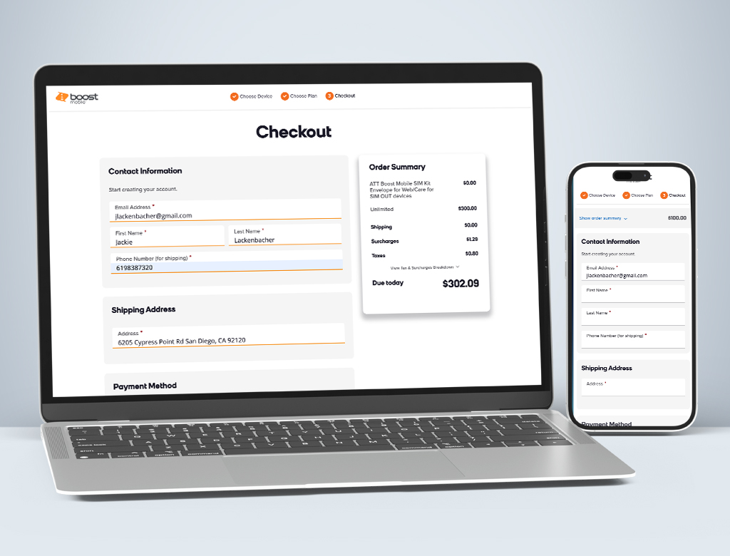
The system extended beyond marketing pages into AEM and into Magento’s billing, subscription, payment, and plan-selection flows, creating a more consistent experience from plan comparison through checkout. I also documented naming conventions, coding guidance, and usage rules so the new Frontend team could build and test components independently rather than copying and modifying them by hand.

Outcome & Impact

  • Post-launch, bounce rate dropped an estimated 12%* and average time on site increased an estimated 18%*. The system also unified account, billing, and plan-selection flows under one UI framework, bringing transactional pages back in line with the marketing experience.
  • The system consolidated three disconnected sources into one Figma-based foundation for designers, content authors, and developers, reducing new-page build time by an estimated 30%* through reusable patterns.
  • Most importantly, it gave Dish Network’s retail wireless division a scalable foundation for launching or redesigning brands without rebuilding from scratch
* Estimated figures based on typical post-launch design system outcomes. Replace with your own analytics before publishing.
image showing in desktop
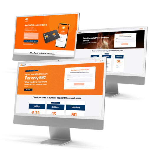
Acquisition and plan-comparison pages built from the shared component library across Boost Mobile's retail wireless experience.

Reflection

If I were starting this project again, I would push for a formal governance model earlier, not after the system had already grown. Adoption relied heavily on documentation and one-on-one walkthroughs with other designers and developers; a lightweight review process for who could add or change a token would have made the system more resilient once I moved on to other engagements.

I would also introduce a token-syncing plugin, such as Tokens Studio, from day one rather than partway through. Manually keeping four brand themes aligned with the global tokens worked, but it depended on discipline rather than tooling, and any system that depends on someone remembering to update four files eventually breaks. What I am proudest of is that the system did not just solve a design consistency problem; it changed how three teams that had never really worked from the same source of truth began doing exactly that.