I volunteered as the sole UX/UI and visual designer for a full redesign of the Greater DC Diaper Bank's website, matched through Catchafire's pro bono program. The nonprofit's original site required donors, volunteers, and parents in need of diapers to navigate a single, undifferentiated structure, and none could quickly find what they needed. I rebuilt the information architecture around those audiences, documented it in a reusable UI kit, and proposed a redesigned donation flow after identifying friction in the site's most important conversion path. Several elements of that work, including the navigation structure and UI patterns, made it into the organization's live site.
The Problem
Greater DC Diaper Bank exists because of numbers the organization states plainly on its homepage: 1 in 5 families in the DMV area live below the Federal Poverty Level; the average annual cost of infant care in the region is $16,534; and none of that, zero percent, is covered by food stamps or WIC. A mission built on stakes like that only works if the people who fund it, staff it, and need it can find the right page in a few clicks.
The original site made that harder than it needed to be. Donors, volunteers, and caregivers were funneled through a single shared structure with no clear signal about which path was theirs, and the donation flow, the organization's primary fundraising mechanism, created enough confusion to cause real drop-off. For a small nonprofit that depends on that flow to keep its programs running, that was not a cosmetic problem. It was a leak in the pipeline of funds.
The original site made that harder than it needed to be. Donors, volunteers, and caregivers were funneled through a single shared structure with no clear signal about which path was theirs, and the donation flow, the organization's primary fundraising mechanism, created enough confusion to cause real drop-off. For a small nonprofit that depends on that flow to keep its programs running, that was not a cosmetic problem. It was a leak in the pipeline of funds.
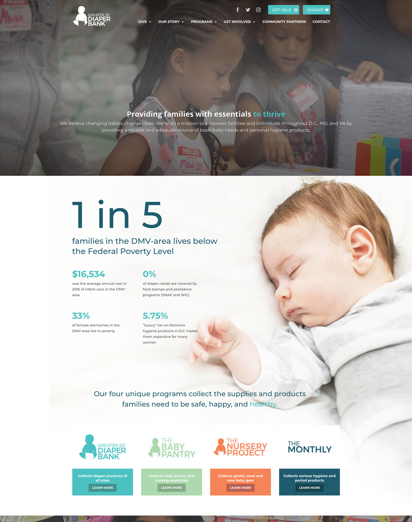
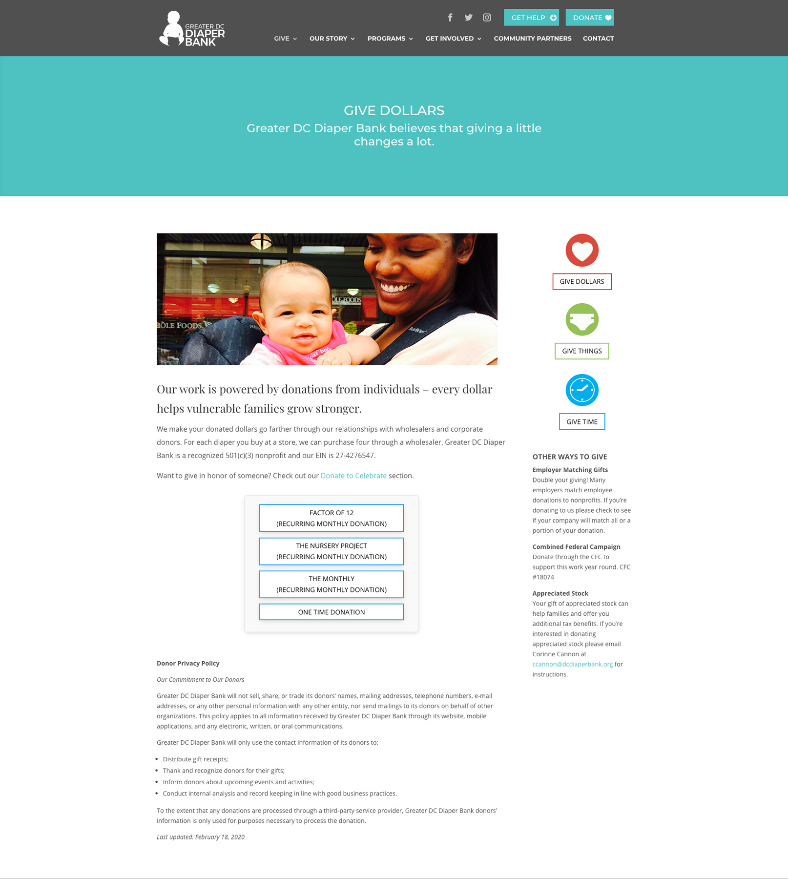
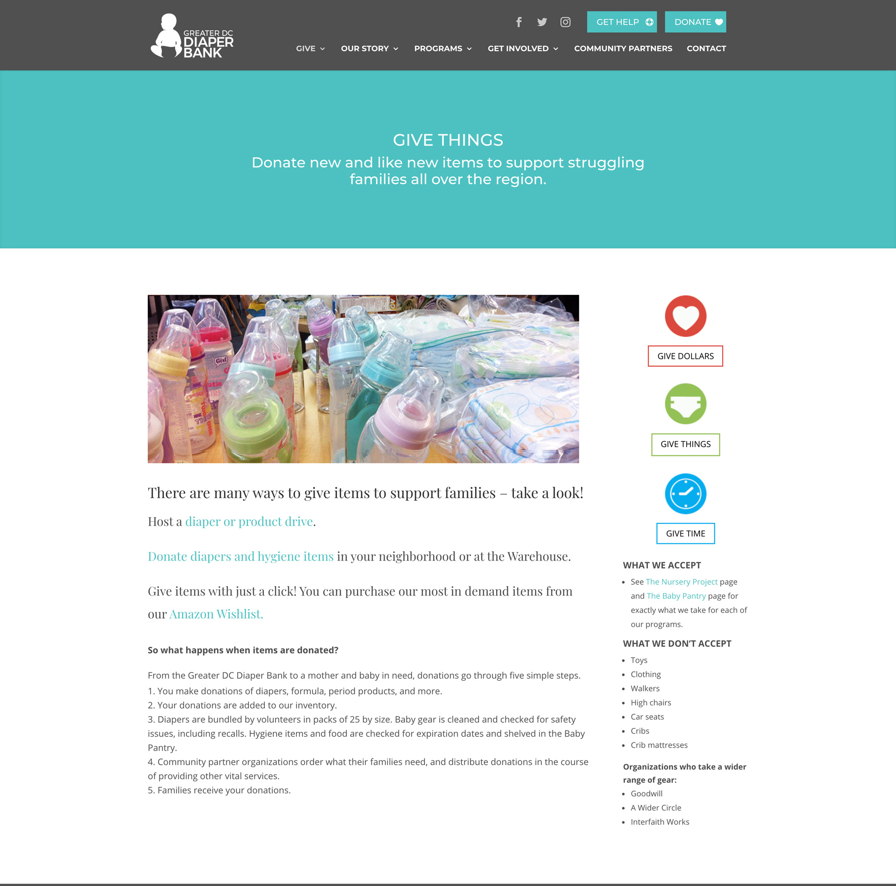
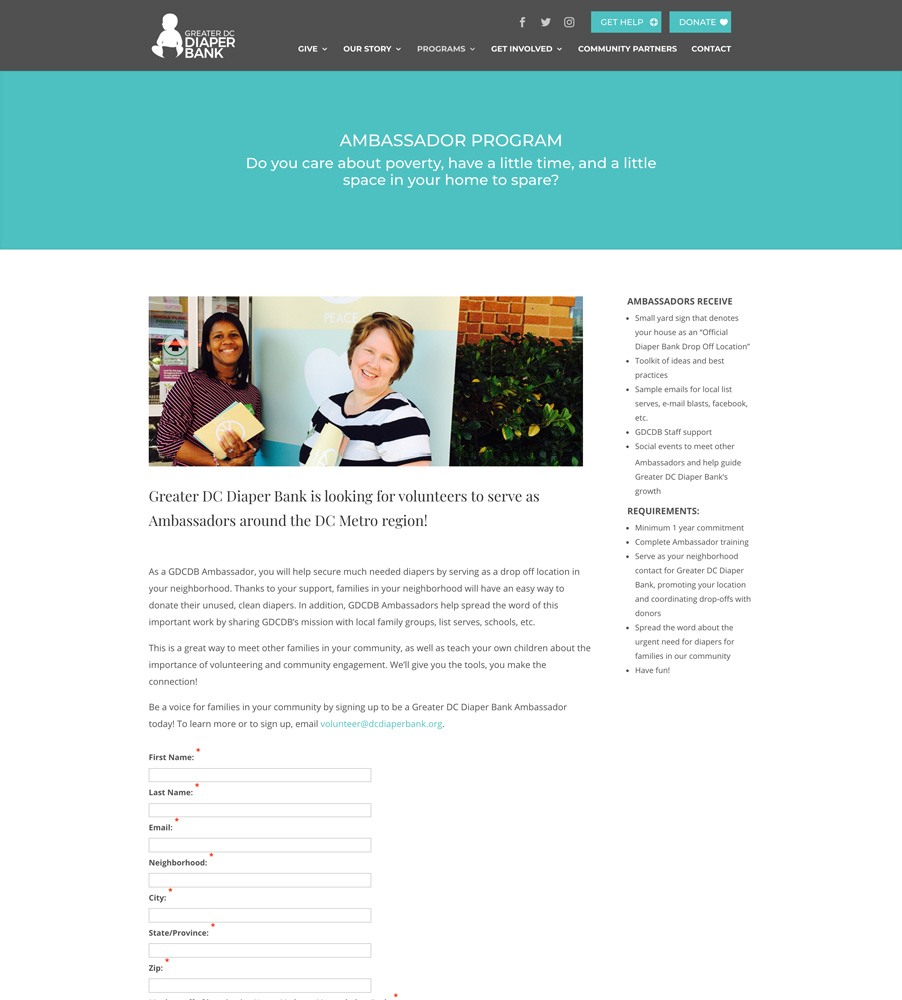
The original homepage. Donors, volunteers, and parents in need shared one undifferentiated path, even though the mission stats made the stakes clear.
Process & Research
I started with the question every information architecture project should ask: Who is actually here, and what are they trying to do? Drawing on the Diaper Bank's site analytics, I analyzed behavior patterns and the most-visited pages to distinguish what people were doing from what the old navigation assumed they wanted. That analysis revealed four distinct groups sharing a single site: donors, parents in need of support, volunteers, and everyone else seeking general information.
I mapped all four into a new sitemap and color-coded each node by audience, so the taxonomy itself made the different paths visible before a single screen was designed. That is a direct application of a principle Nielsen Norman Group returns to often in its information architecture research: navigation should mirror how users already think about the content, not how the organization is structured internally. The Give section is cleanly split into Give Dollars, Give Things, and Give Time, matching the three ways people actually want to help rather than burying them under a single generic Donate link.
I mapped all four into a new sitemap and color-coded each node by audience, so the taxonomy itself made the different paths visible before a single screen was designed. That is a direct application of a principle Nielsen Norman Group returns to often in its information architecture research: navigation should mirror how users already think about the content, not how the organization is structured internally. The Give section is cleanly split into Give Dollars, Give Things, and Give Time, matching the three ways people actually want to help rather than burying them under a single generic Donate link.
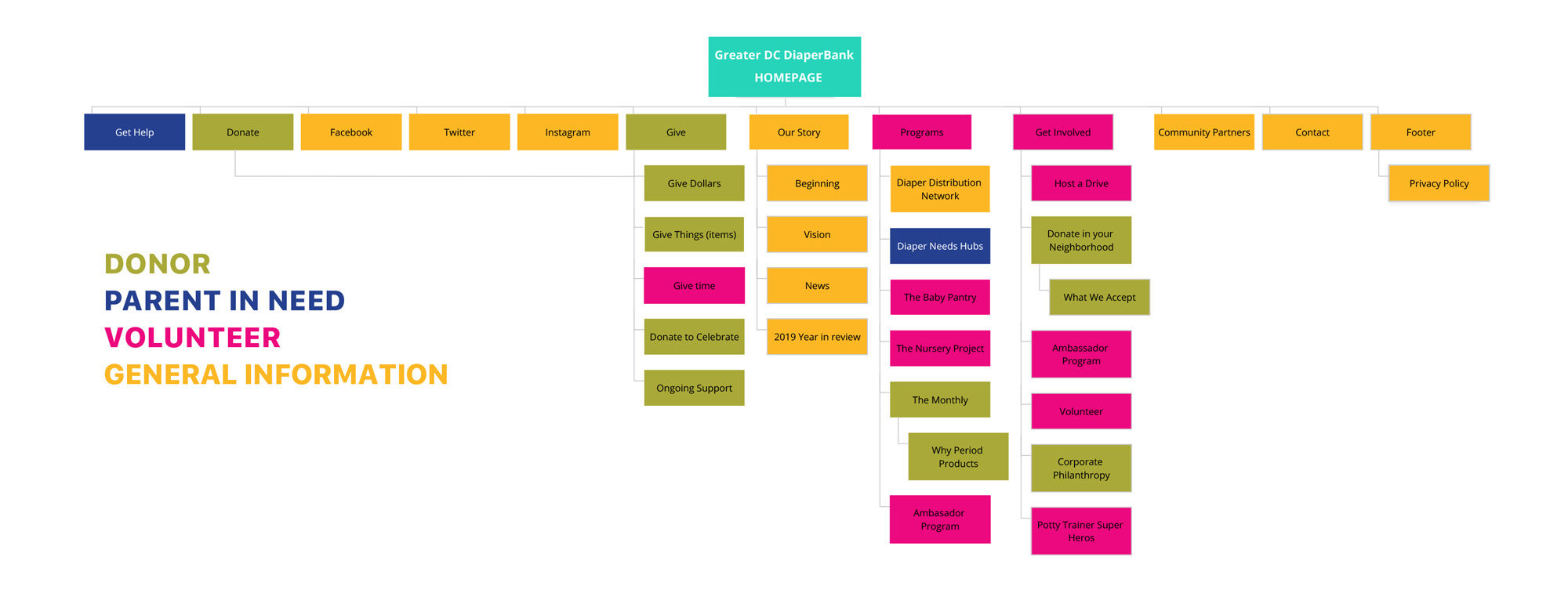
The redesigned sitemap, color-coded by audience: donor, parent in need, volunteer, and general information.
From there, I moved through low-fidelity wireframes to lock structure and flow, then high-fidelity wireframes to test layout and content density before committing to visual design. The donation flow got the closest look. Once I saw where people were getting stuck when choosing between giving money and giving goods, I built a working prototype and used it to A/B test a redesigned flow, which gave stakeholders something concrete to react to rather than an abstract argument for change.

Low-fidelity wireframes are used to lock in structure and flow before any visual design decisions are made.
The Solution
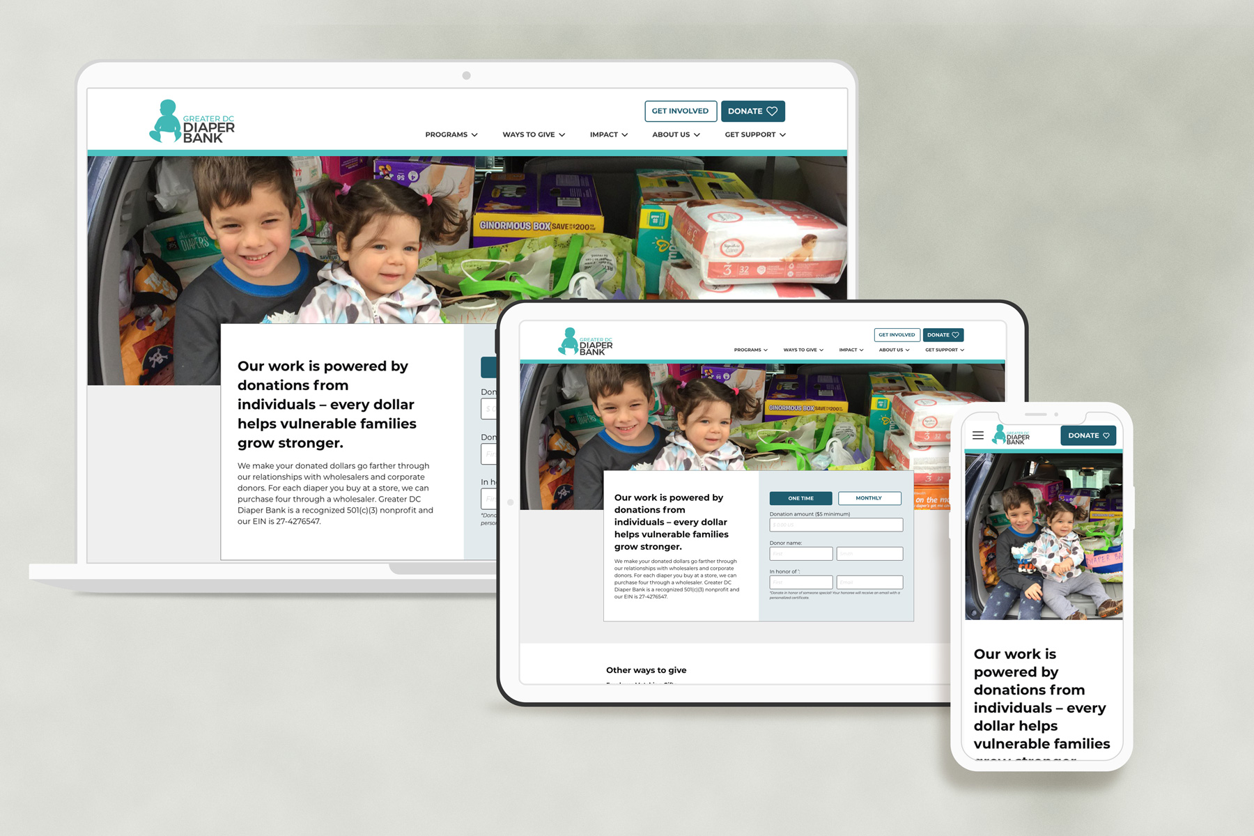
The final design gives donors, volunteers, and parents in need a clear, separate path from the homepage, rather than asking them to navigate a single generic structure. The main navigation is reorganized around Programs, Ways to Give, Impact, About Us, and Family Support, replacing the old flat list of links with groupings that match how each audience thinks about the site.
On the giving side, three simple entry points, Give Dollars, Give Things, and Give Time, replace a single ambiguous donate link. The redesigned donation form separates one-time and monthly gifts with a clear toggle, rather than forcing users to hunt for the option. On the Family Support side, I designed a zip code search that lets a parent find their nearest diaper distribution partner in seconds, rather than having to read through paragraphs of program descriptions first.
On the giving side, three simple entry points, Give Dollars, Give Things, and Give Time, replace a single ambiguous donate link. The redesigned donation form separates one-time and monthly gifts with a clear toggle, rather than forcing users to hunt for the option. On the Family Support side, I designed a zip code search that lets a parent find their nearest diaper distribution partner in seconds, rather than having to read through paragraphs of program descriptions first.


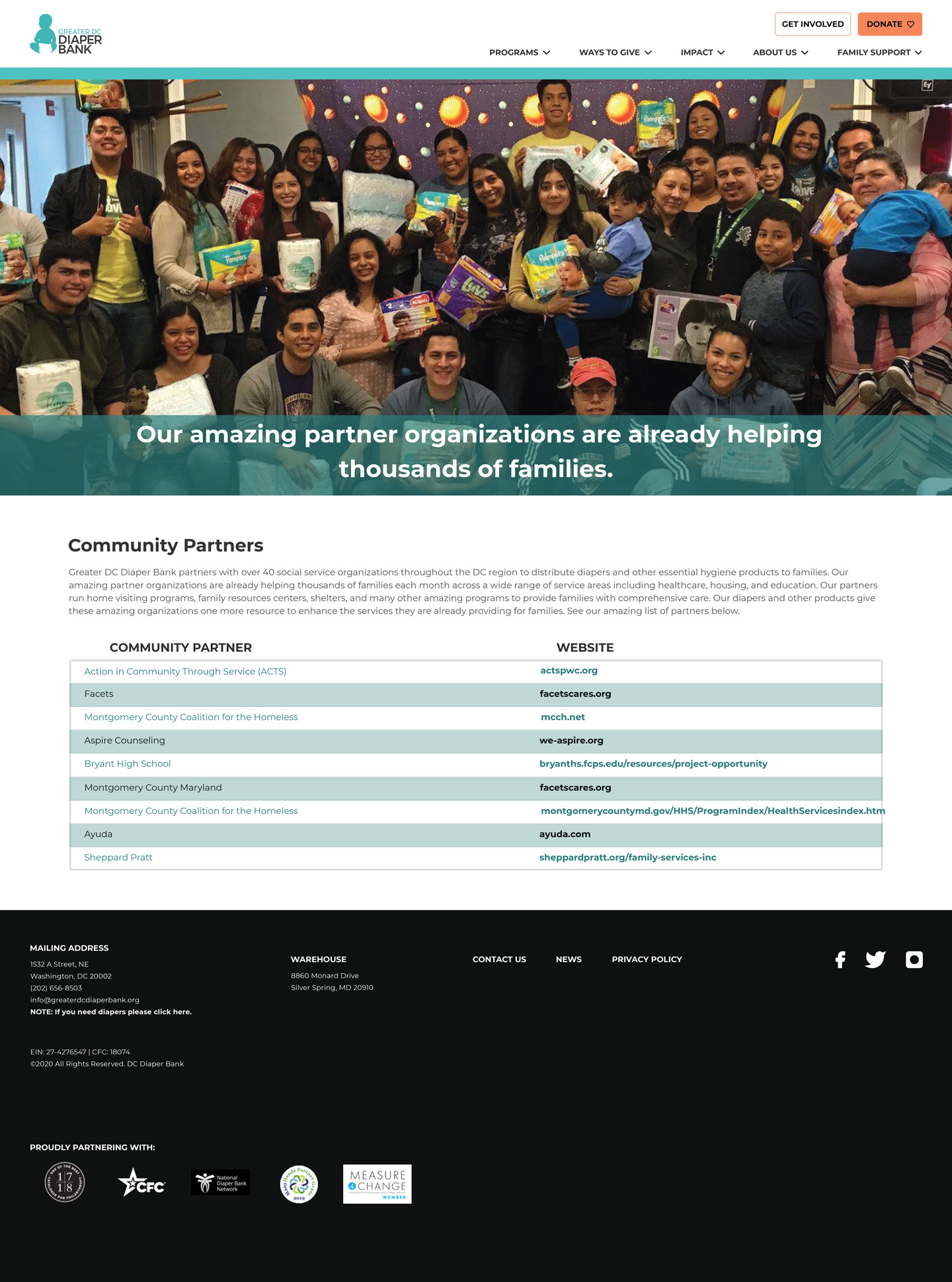
The Family Support page includes a zip-code search that helps a parent find their nearest diaper distribution partner in seconds.
Under the pages themselves, I built a full UI kit: a documented color system with primary and secondary palettes and tint variations, a type scale from H1 through H4 for both desktop and mobile, with defined font sizes and line heights, and reusable navigation, footer, and form components. That system did two jobs at once. It kept the new site visually and functionally consistent, which is Nielsen Norman Group's consistency and standards heuristic in practice, and it gave the Diaper Bank's small team a set of building blocks they could reuse and extend without needing a dedicated designer for every future update
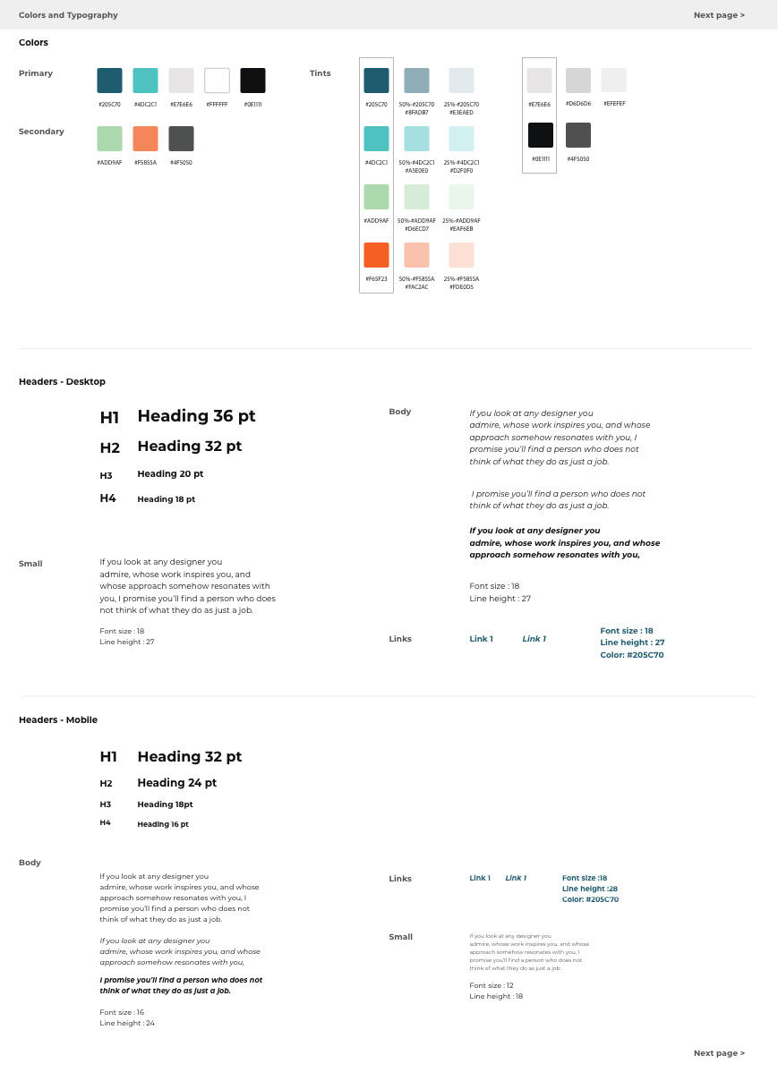

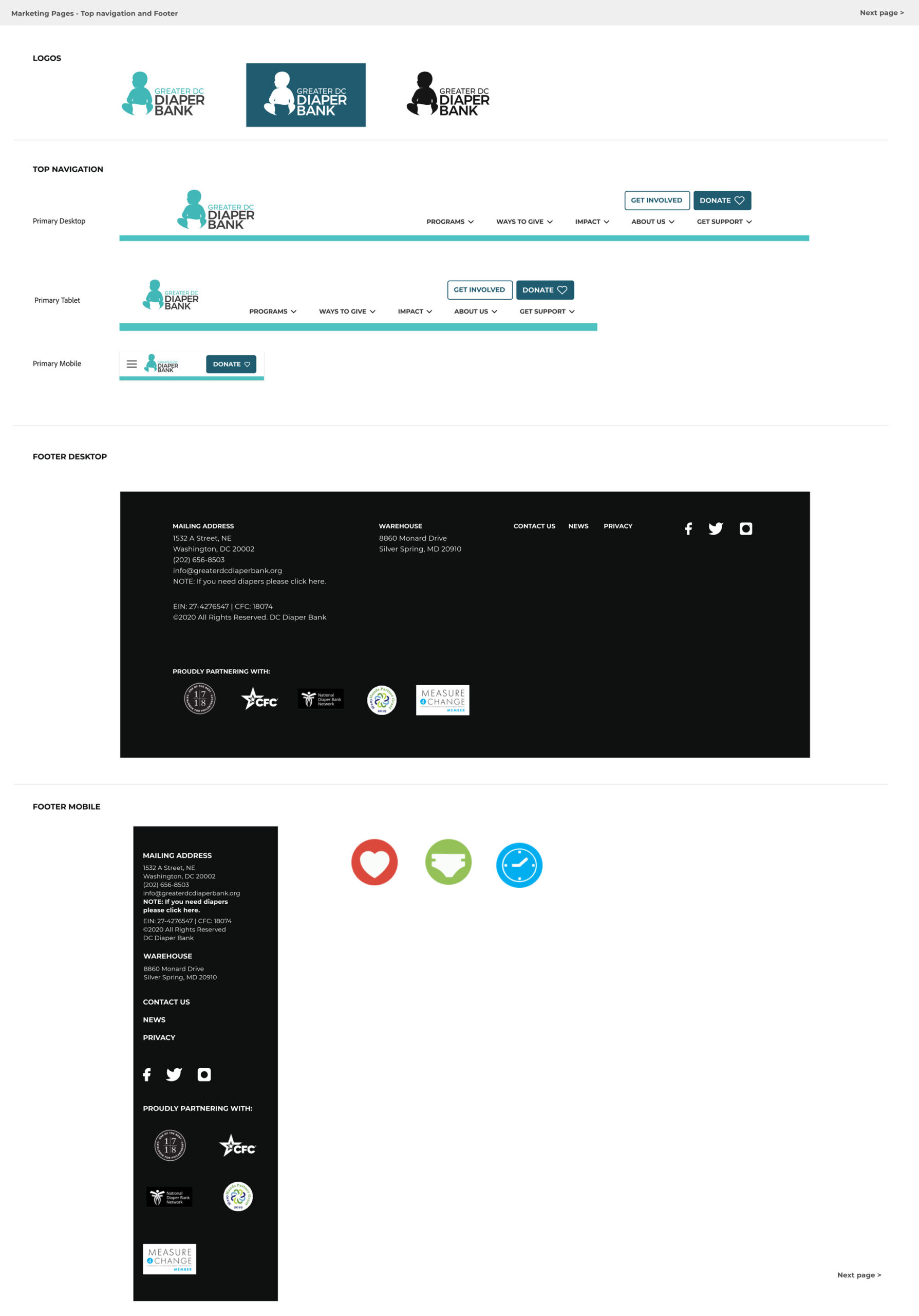
The UI kit's color system and type scale, documented separately for desktop and mobile.
REFLECTION
This project turned design theory into practical, mission-driven work. As a solo volunteer designer on a nonprofit timeline, I had to ground decisions in real user behavior, simplify paths for donors, volunteers, and families, and create a reusable system the Diaper Bank could maintain beyond my involvement.
Although I did not have post-launch analytics or live A/B test results, the organization adopted key parts of the redesign, including the navigation structure and UI kit patterns, which showed that the work addressed a real organizational need. The project also reinforced the importance of building with evidence, consistency, and long-term usability in mind; if I had more time, I would add lightweight usability testing and post-launch analytics to validate the new information architecture and donation flow with measurable data.
Although I did not have post-launch analytics or live A/B test results, the organization adopted key parts of the redesign, including the navigation structure and UI kit patterns, which showed that the work addressed a real organizational need. The project also reinforced the importance of building with evidence, consistency, and long-term usability in mind; if I had more time, I would add lightweight usability testing and post-launch analytics to validate the new information architecture and donation flow with measurable data.