Ink Tank is a mobile app I designed end-to-end, from research and information architecture to interface design and an interactive prototype, providing a single guided path from tattoo inspiration to a booked appointment with a vetted artist. Americans spend an estimated $1.65 billion a year on tattoos, yet almost no product guides them through the entire decision-making process. I designed Ink Tank to close that gap by scoping out a launch-ready directory of more than 1,000 curated artists and studios across the U.S.
Tattoo Mobile App - Ink Tank
Designing a mobile experience that turns tattoo research into a booked appointment
Tattoo Mobile App - Ink Tank
Designing a mobile experience that turns tattoo research into a booked appointment
Overview
Information
Client
CareerFoundry — UX/UI Design Immersive, capstone project
Role
Solo UX Researcher, UI & Visual Designer, Prototyper
Industry
Beauty & Personal care services
The problem
Getting a tattoo is permanent, often expensive, and deeply personal, making the research phase high-stakes. Despite that, no single app carried someone through the entire journey: exploring styles, evaluating an artist's portfolio and credentials, understanding what a studio specializes in, and booking with confidence.
Instead, people pieced the process together from Instagram, wildly varying studio websites, and word of mouth. That is a textbook case of what the Nielsen Norman Group calls poor information scent: users must guess which fragmented source will answer their question, and every extra tap or app switch is a chance to lose them. Layer on choice overload, with more styles and artists to compare than anyone can reasonably hold in their head, and Hick's Law predicts exactly what happens: decision time and drop-off both climb as the unstructured options pile up.
The opportunity was to consolidate that scattered research process into one organized, trustworthy product.
Instead, people pieced the process together from Instagram, wildly varying studio websites, and word of mouth. That is a textbook case of what the Nielsen Norman Group calls poor information scent: users must guess which fragmented source will answer their question, and every extra tap or app switch is a chance to lose them. Layer on choice overload, with more styles and artists to compare than anyone can reasonably hold in their head, and Hick's Law predicts exactly what happens: decision time and drop-off both climb as the unstructured options pile up.
The opportunity was to consolidate that scattered research process into one organized, trustworthy product.
Wireframes
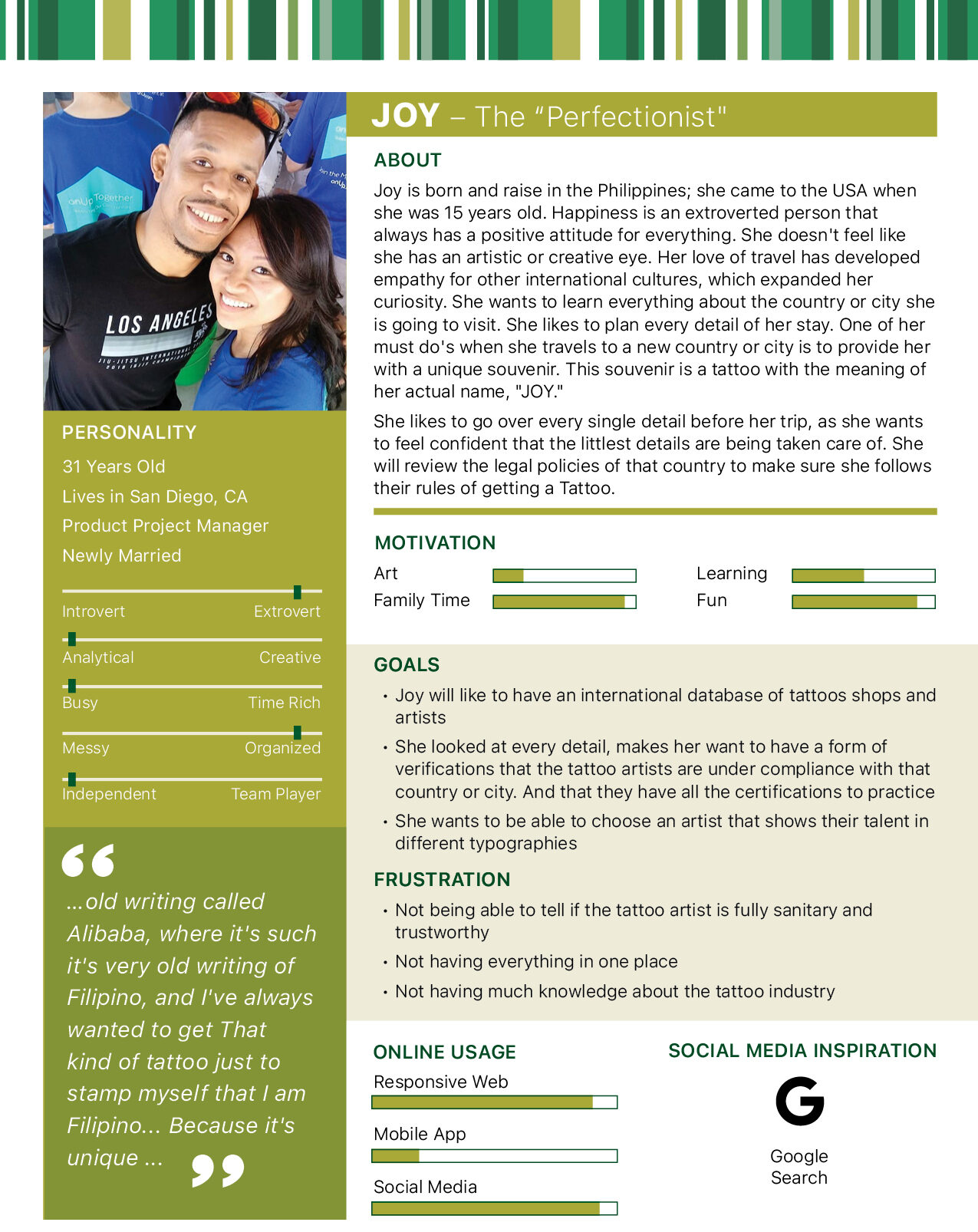
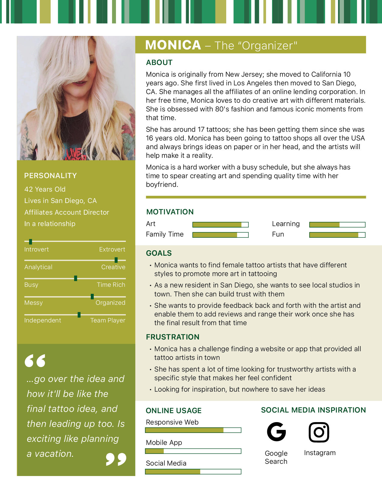
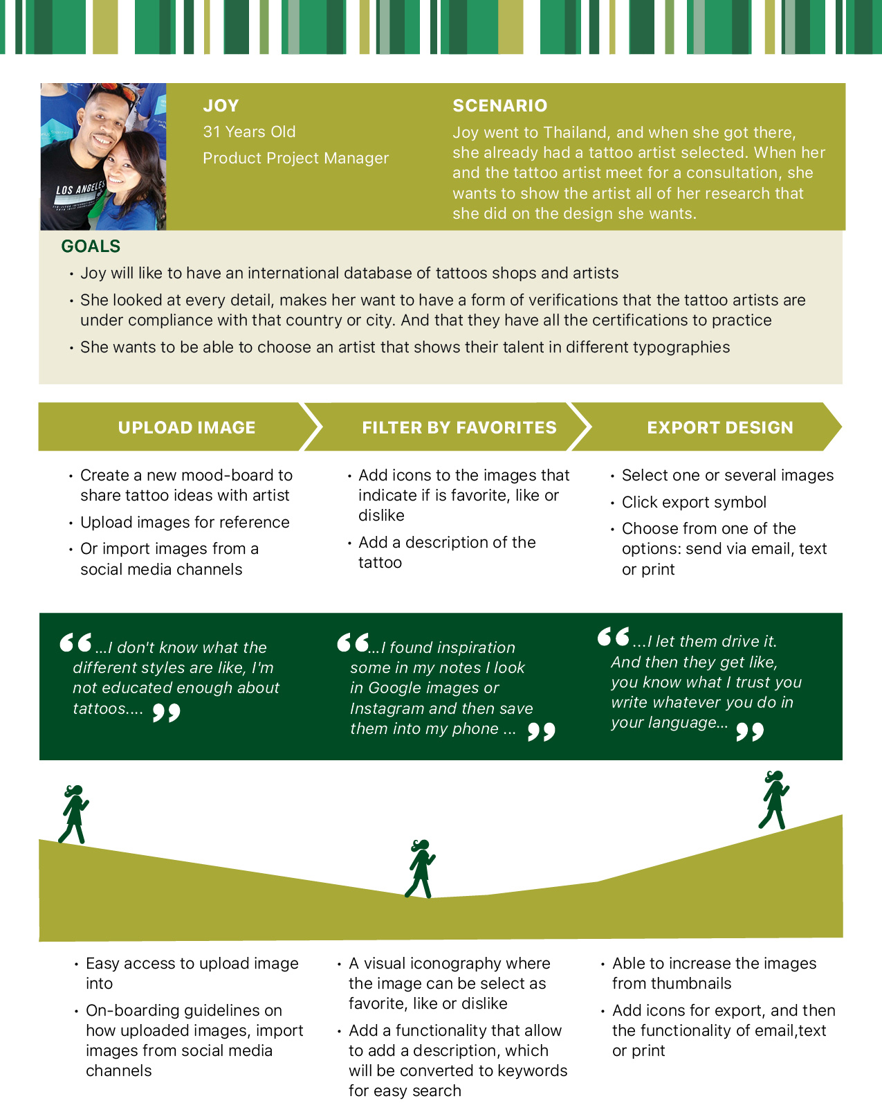
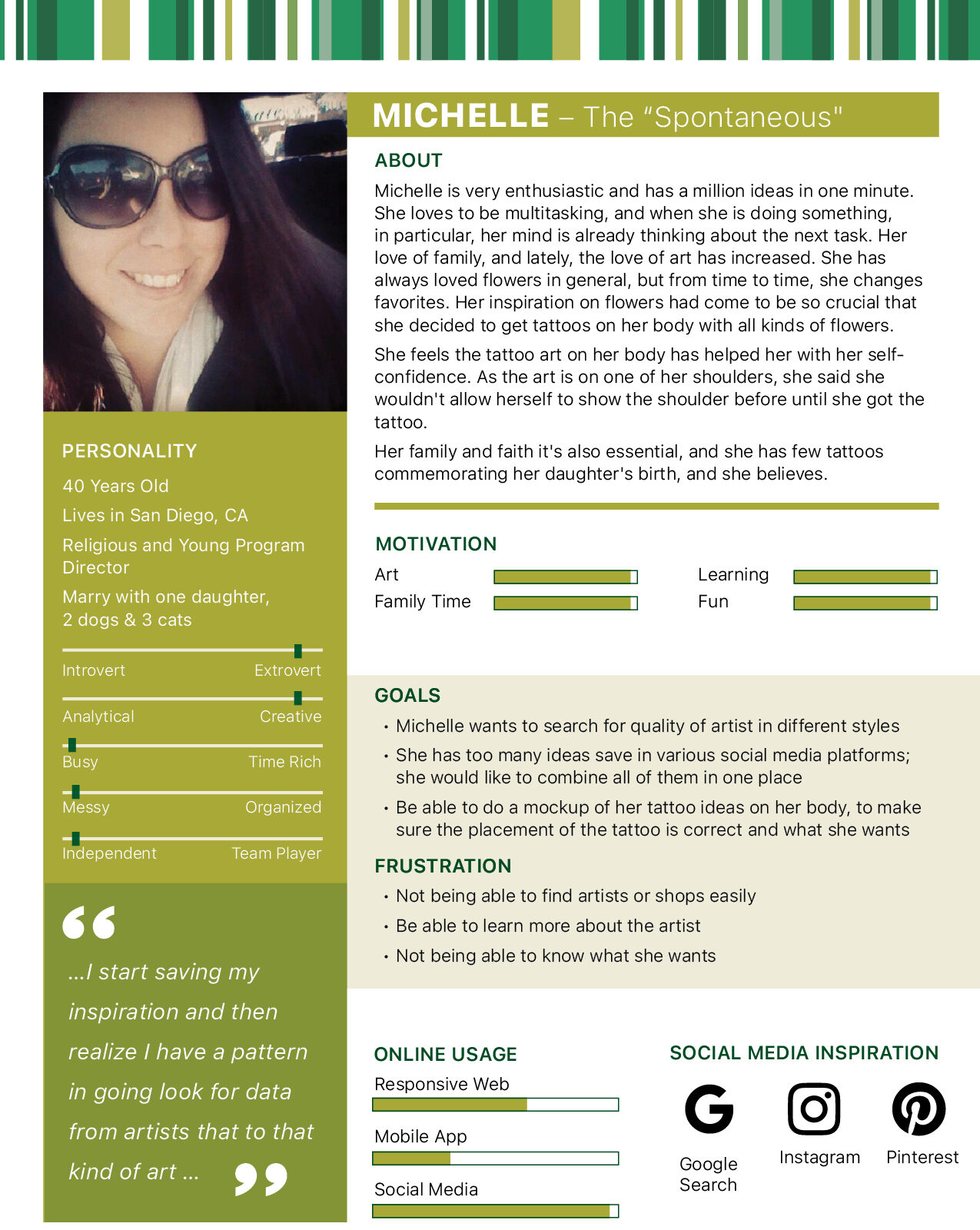
I started by figuring out who needed this app and why the existing options were not working for them. That research produced three personas, Monika, Michelle, and Joy, each representing a different relationship to getting a tattoo, from a confident returning client to someone who needed far more reassurance before committing.
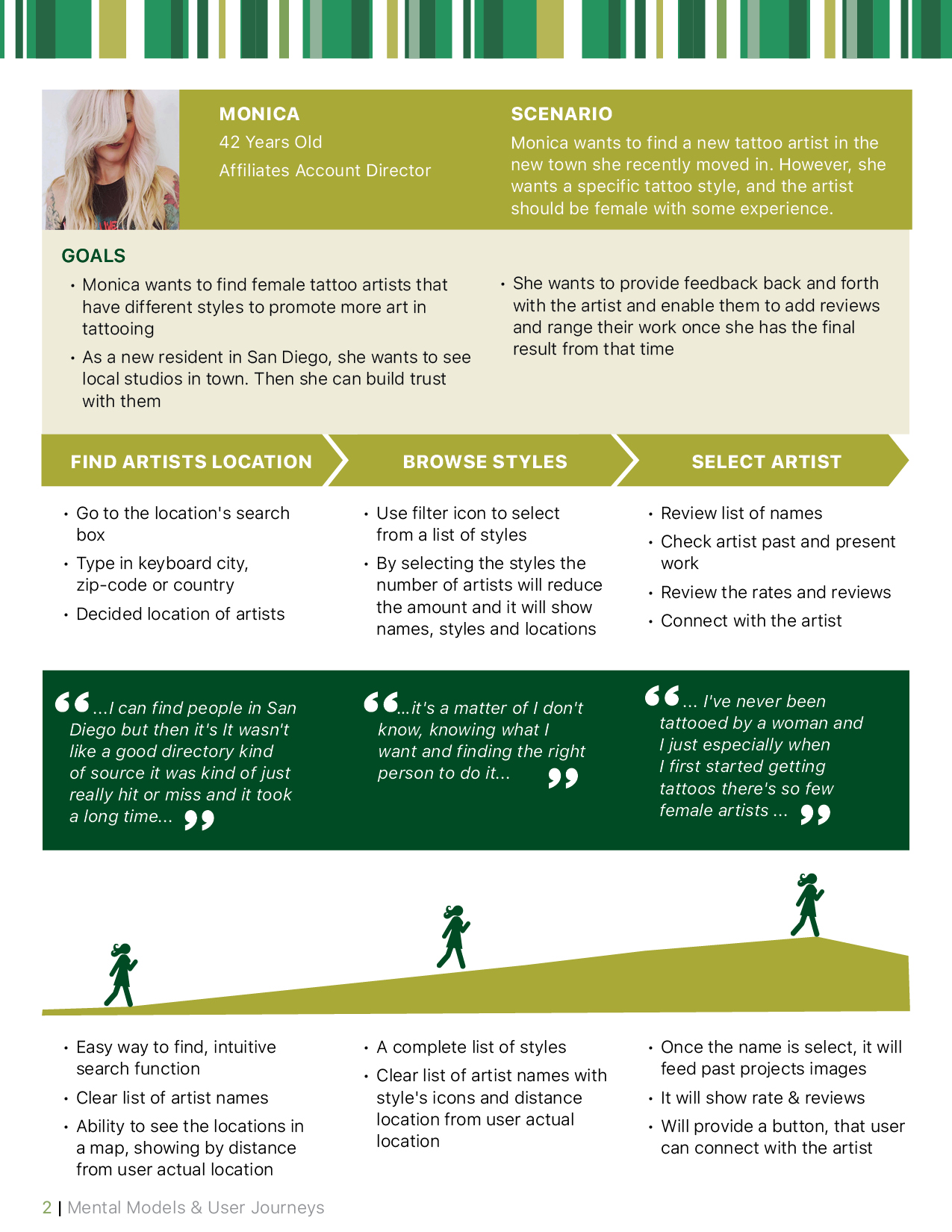
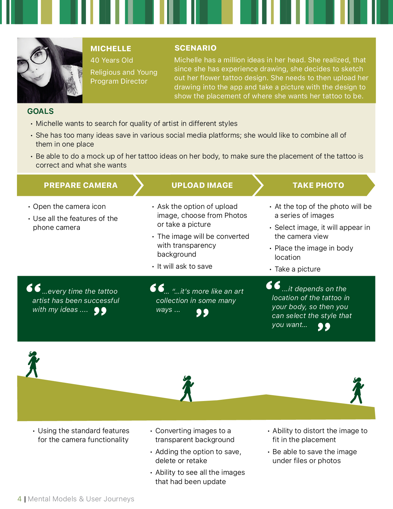
From there, I mapped a user journey for each persona, tracing their path from first considering a tattoo to walking into a studio. Laying personas and journeys side by side turned abstract needs into concrete screens. It became clear that a first-timer needed education and trust-building content, artist credentials, studio reviews, and style explainers before ever tapping Book, while a returning client mostly needed fast, low-friction access to a specific artist's calendar.
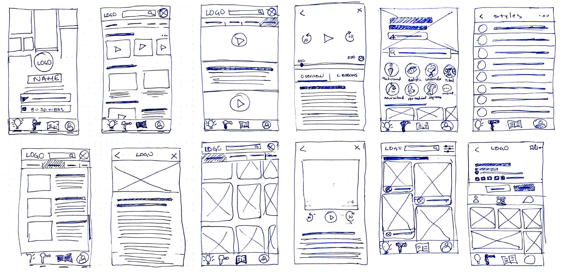
With those needs mapped, I moved into low-fidelity wireframes to lock down the app's core structure, including onboarding, artist discovery, profile details, and booking, without getting distracted by visual polish. Sketching at low fidelity let me quickly iterate through several navigation structures and test the flow logic before investing time in pixels.
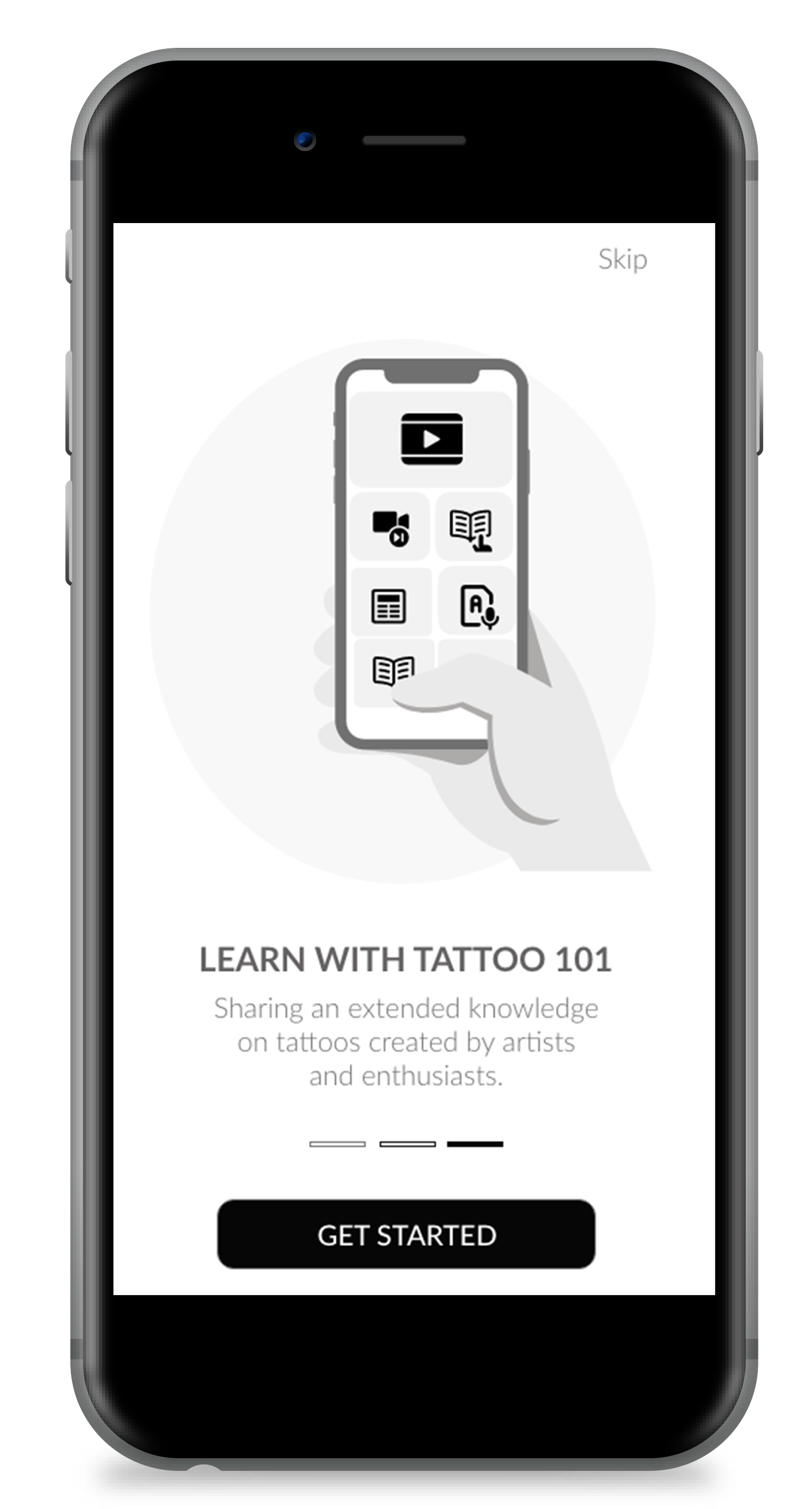
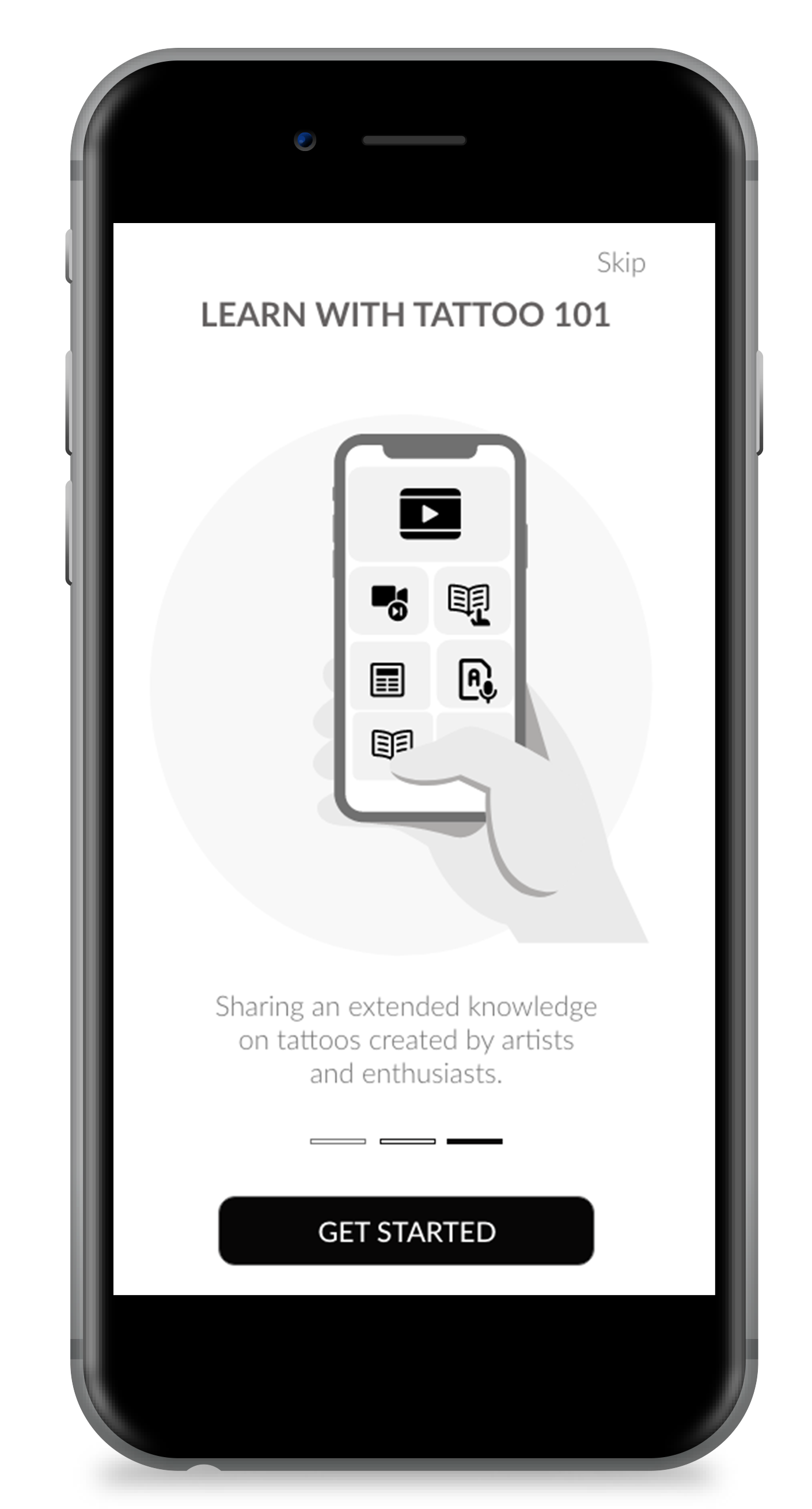
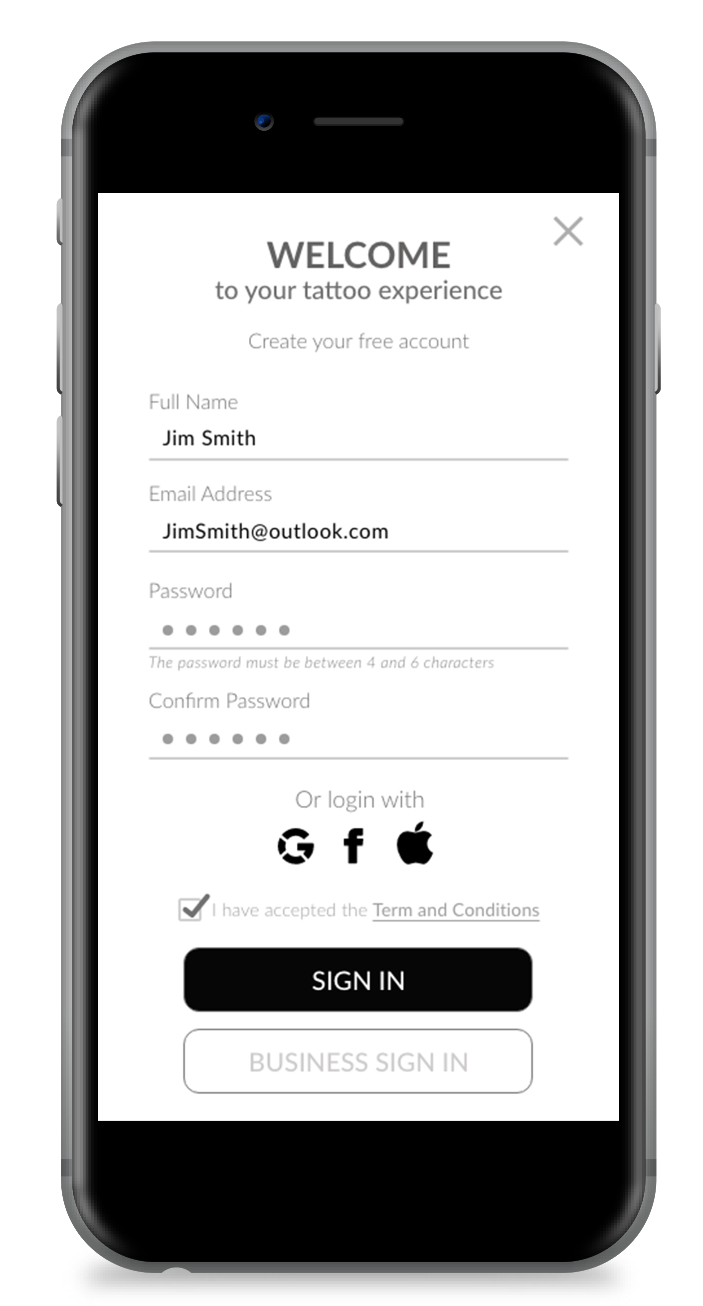
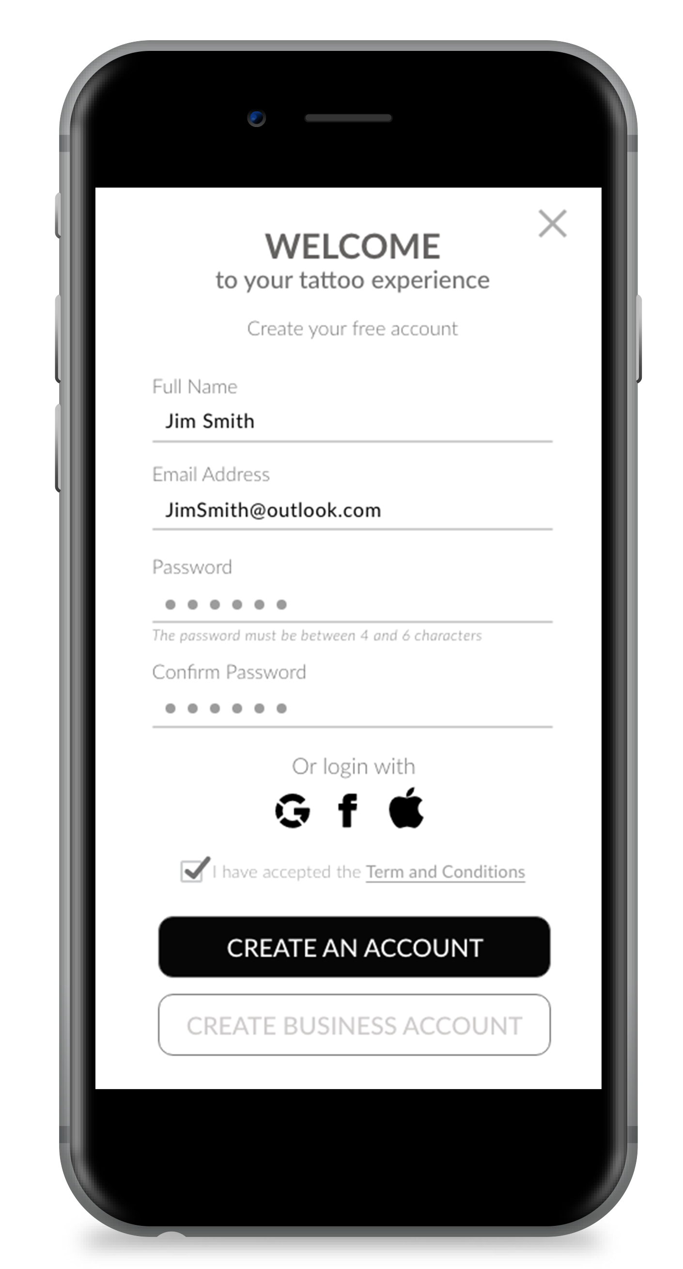
I then built mid-fidelity wireframes and ran usability testing focused on the onboarding and sign-up flow, since that is the first impression and the point where users are most likely to abandon an app before it has proven any value. Testing revealed friction in how the initial flow requested information; I used that feedback to simplify sign-up into fewer, clearer decisions before a person ever reaches the artist directory.
Onboarding and sign-up screens were refined after usability testing surfaced friction in the original flow.
THE SOLUTION
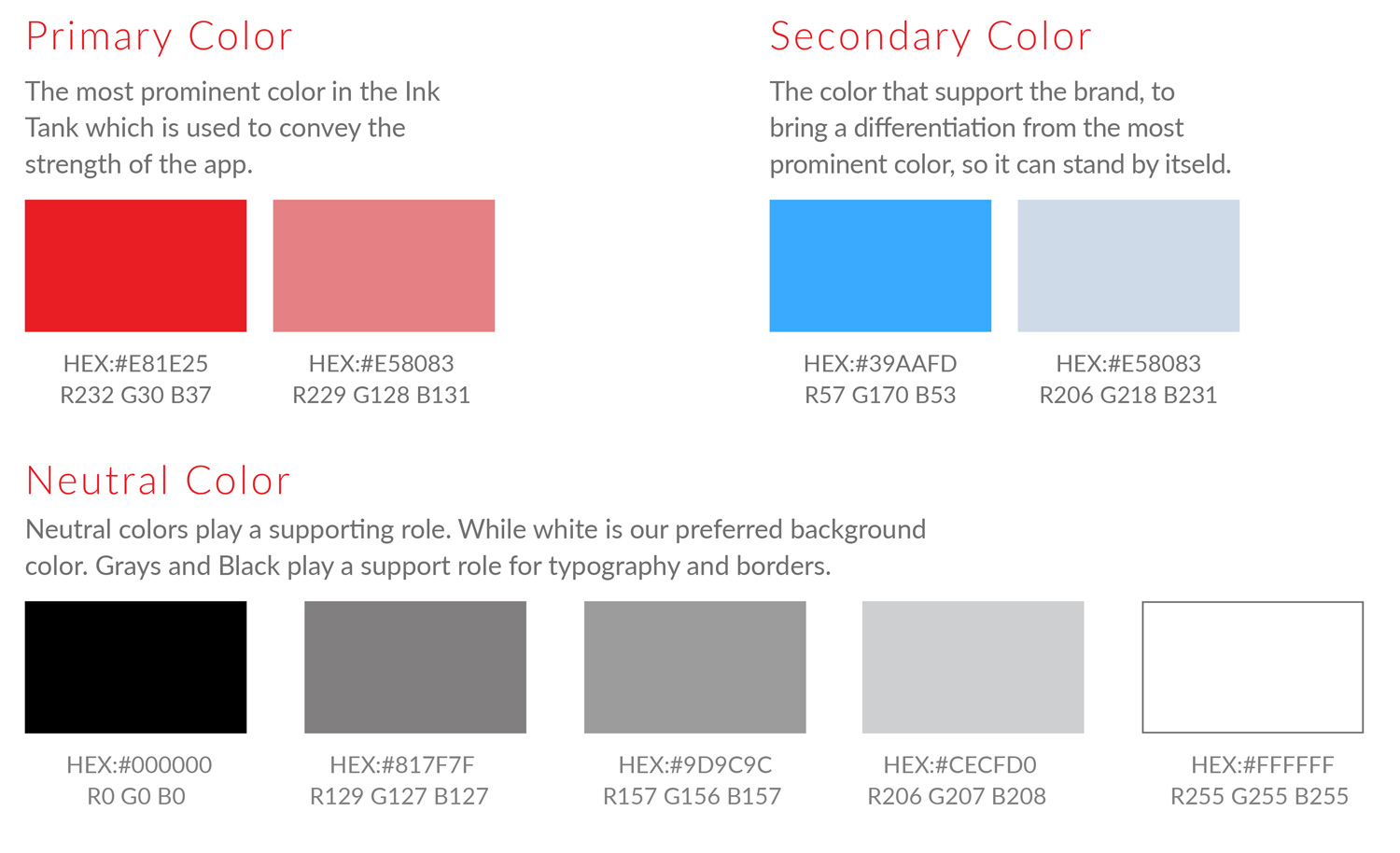
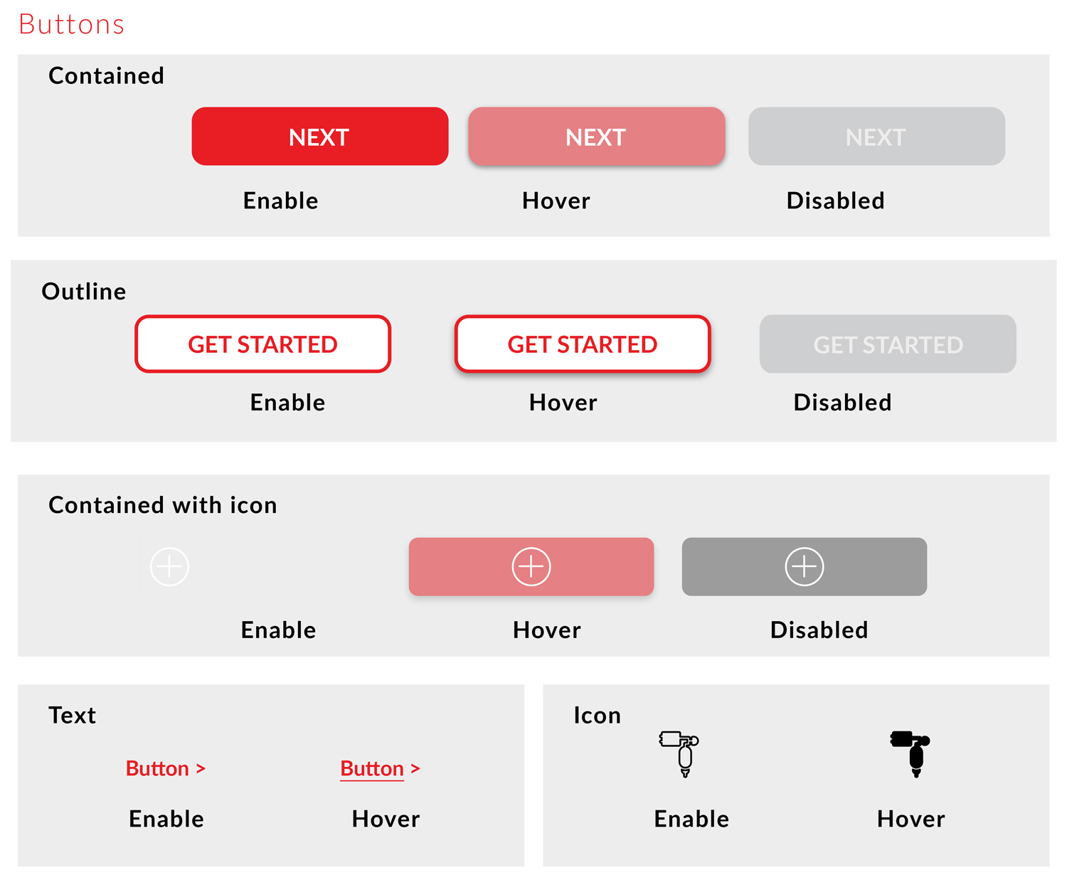
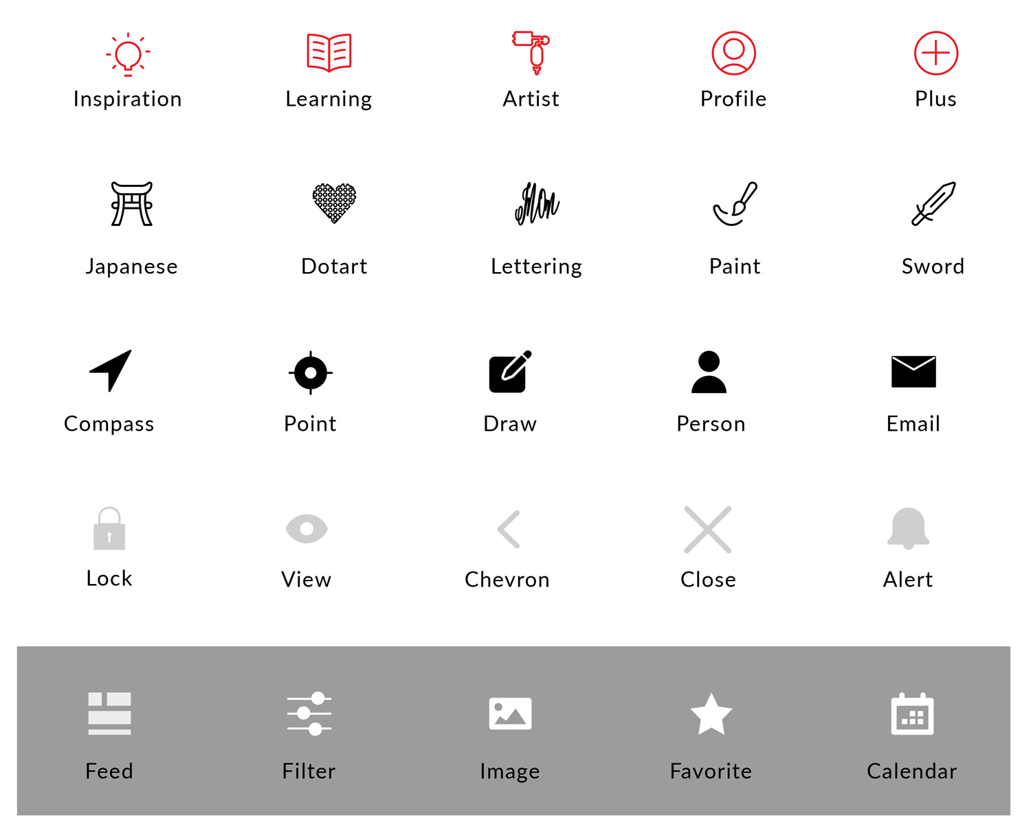
A product built around trust, focused on artist portfolios, studio credentials, and pricing, needed a visual language that felt considered rather than improvised. I defined a color palette, typography scale, iconography set, and button and component states before finalizing any screen, so the directory, profiles, and booking flow read as a single, coherent product rather than a set of disconnected mockups.
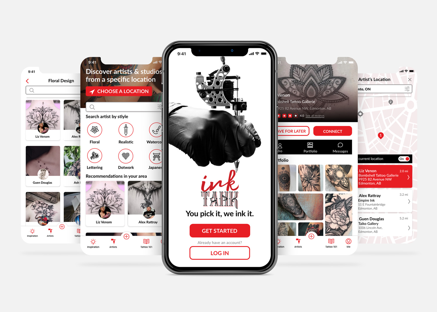
On top of that system, Ink Tank guides a user through four core moments: onboarding that sets expectations and builds initial trust, a browsing and discovery experience for exploring artists and styles, detailed artist and studio profiles that surface the credentials and portfolio work needed to make a decision, and a streamlined booking flow that turns that decision into a confirmed appointment.
REFLECTION
As a concept rather than a finished product, success is measured by scope and rigor, not live usage data. Ink Tank's design includes a launch-ready directory of over 1,000 curated artists and studios across the U.S., targeting a market where Americans spend about $1.65 billion annually on tattoos and where digital infrastructure is minimal. This gap justified the project, and I designed Ink Tank as a foundation for a team to expand with marketing and an educational website, not just a set of screens.
The key lesson was how important the distinction between personas and journeys actually is. When I linked a persona's anxieties to a specific point in their journey, decisions about what to explain or hide became clearer.
Going further, I'd want real usability data from tattoo studios and clients, especially on how much artist verification info is needed before trusting a profile. I'd also improve progressive disclosure by providing users with just enough information at each step rather than everything upfront.
The key lesson was how important the distinction between personas and journeys actually is. When I linked a persona's anxieties to a specific point in their journey, decisions about what to explain or hide became clearer.
Going further, I'd want real usability data from tattoo studios and clients, especially on how much artist verification info is needed before trusting a profile. I'd also improve progressive disclosure by providing users with just enough information at each step rather than everything upfront.