Building Trust Into Compliance

Redesigning a Controlled Substance Monitoring Dashboard

Building Trust Into Compliance

Redesigning a Controlled Substance Monitoring Dashboard

Overview

Under a national opioid settlement, one of the country's largest pharmaceutical distributors was bound by court-ordered injunctive relief to operate a Controlled Substance Monitoring System capable of flagging suspicious orders and documenting due diligence on every controlled-substance sale. The Legal and Compliance department built the required dashboard under deadline pressure, without a UX designer on the team.

I was brought in first to audit it, then stayed on as embedded Lead UX/UI Designer for a year and a half, running the assessment that became the team's shared roadmap, building the company's first component library for the application, and cutting new-feature production time roughly in half in the process.

Information

Client

Confidential per NDA, a Fortune 500 pharmaceutical distributor, Legal & Compliance division

Role

Lead UX/UI Designer, embedded contractor 

Industry

Pharmaceutical Distribution / Regulatory Compliance (RegTech)

The Problem

Following the 2022 National Opioid Settlement, distributors agreed to ten years of court-ordered injunctive relief requiring enhanced controlled-substance monitoring systems, overseen by an independent third-party monitor. Separately, DEA regulation 21 CFR 1301.74(b), reinforced by the 2018 SUPPORT Act, requires every DEA registrant that distributes controlled substances to design a system that identifies “orders of unusual size, orders deviating substantially from a normal pattern, and orders of unusual frequency,” and to report them through the DEA's Suspicious Orders Report System. For a distributor, failing either requirement puts the license to distribute controlled substances at risk. This was never a cosmetic project.

To meet an internal launch screen that indicated whether a task was complete, in progress, or stuck, the department called in Perficient. I came in as a target in the first half of 2023. The department built its own solution: a Project Owner who knew the due diligence process end-to-end and documented requirements, and in-house Frontend and backend developers built the application. No UX designer was involved. It shipped functional but hard to use. There was no persistent navigation, so users could not tell where they were in a multi-step review. Some license-review events took up to two minutes to load. 

Role & Team

My first engagement was an independent UX IQ Assessment: an expert review built around 100 markers across ten categories (Findable, Credible, Functional, Efficient, Usable, Understandable, Enjoyable, Aesthetic, Accessible, and Exceptional), in the tradition of the heuristic evaluation method Nielsen Norman Group has published and refined for over two decades. I ran it solo, walking every task in the application, interviewing the people who used it daily, and scoring each marker against evidence I could point to on screen.
System architecture map: services layer, API gateway, and microservices redrawn as a generic system diagram
When I presented the findings to the department's senior stakeholder, the response was immediate: redesign the dashboard. I put together an enhancement concept featuring new navigation patterns and a component-level breakdown of effort, impact, and priority. The project stalled and was canceled. It had been scoped around design alone, without the Project Owner, business analysts, or the engineers who understood the system's real constraints. That failure taught me the lesson that shaped everything after: you cannot redesign a regulated system you don't understand end to end, and you cannot do it without the people who built it in the room.

What came next was different. I joined the core delivery team as an embedded Lead UX/UI Designer under contract for a year and a half, working on an Agile cadence alongside the Project Owner, Project Manager, business analysts, front-end and back-end developers, and QA. Early on, the engineering team walked me through the full system architecture: a services layer covering the dashboard, license review, KYC surveys, and law-enforcement tasks, authenticated through single sign-on and an API gateway, and backed by microservices for red-flag analysis and dispensing-data ingestion. Understanding that architecture reframed the work, shifting it from “redesign the dashboard” to “prioritize the highest-friction workflows inside a live regulatory system that could not go down.”

Process & Research

UX IQ scorecard, redrawn as a generic bar or radar chart across the ten assessment categories (Findable, Credible, Functional, Efficient, Usable, Understandable, Enjoyable, Aesthetic, Accessible, Exceptional)
Every project that followed ran through the same discipline: understand the business requirement with the BA, observe and interview the people doing the task today, sketch alternatives, prototype, and test with users and developers before anything reached a sprint.

The assessment findings became the backlog. Findable scored 16 of 40 because there was no persistent navigation and no sense of place, a real cost given that roughly 70% of users default to primary or top navigation to move through a digital product. Accessible scored 27/35, with WCAG 2.1 AA gaps including missing alt text, absent keyboard focus states, and insufficient color contrast on interactive elements. 

That category matters more than it looks: one widely cited UK accessibility study found 71% of users with a disability leave a site immediately after hitting a barrier, and Pew Research has documented a persistent gap in how often adults with disabilities go online at all compared with the general population, a gap accessible design closes rather than widens.
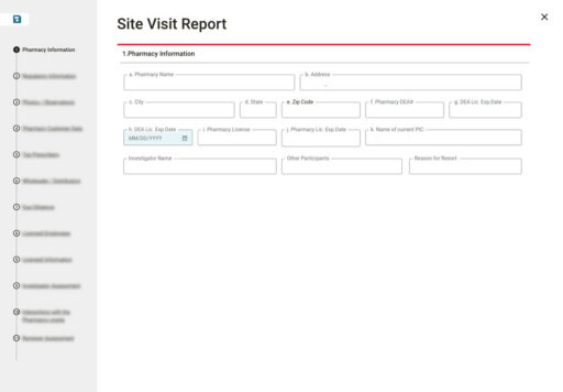
One workflow became the proof of concept for a different way of working: Site Visit Reporting, which compliance officers in the field were still filling out manually. I researched the paper process, designed several wireframe directions, and worked with developers to ship a digital version.

It worked well enough that, weeks later, I was rebuilding the same components for the PIC Interview workflow, and reusing them cut that project's production time to roughly half of what Site Visit Reporting had taken when done standalone. That single number became the case for a real component library instead of one-off screens for every new feature.

The Solution

I built the team's first component and pattern library: around 30 to 35 reusable components adapted from Material UI and a secondary internal kit, documented alongside foundational standards for color, grid, iconography, and typography, plus explicit pattern rules, so functional consistency no longer depended on one designer remembering a decision from six sprints earlier.

On top of that foundation, I led design across various workflows during the engagement: license review and law-enforcement task improvements; a redesigned dispensing-data (PCD) email template and analytics export; a print and export flow for site visit reports; and new concepts for a PIC Interview intake and outcome scorecard. Each followed the same process—requirement, observation, prototype, test, ship—within the same two-week Agile sprint, ensuring design was never a bottleneck.

I also brought consistent visual and brand standards into the application for the first time, aligning typography, color, and input styling with the company's existing digital brand system, closing one of the lowest-scoring findings from the original assessment: an aesthetics score of 30 out of 50, largely because the application had never implemented the design system already in place elsewhere in the company's digital products.
Site Visit Reporting workflow: manual paper process
New design for visit
Site Visit Reporting workflow:digital version adaptation
I built the team's first component and pattern library: around 30 to 35 reusable components adapted from Material UI and a secondary internal kit, documented alongside foundational standards for color, grid, iconography, and typography, plus explicit pattern rules, so functional consistency no longer depended on one designer remembering a decision from six sprints earlier.

On top of that foundation, I led design across various workflows during the engagement: license review and law-enforcement task improvements, a redesigned dispensing-data (PCD) email template and analytics export, a print and export flow for site visit reports, and new concepts for a PIC Interview intake and outcome scorecard. Each followed the same process—requirement, observation, prototype, test, ship—within the same two-week Agile sprint, ensuring design was never a bottleneck.

I also brought consistent visual and brand standards into the application for the first time, aligning typography, color, and input styling with the company's existing digital brand system, closing one of the lowest-scoring findings from the original assessment: an aesthetics score of 30 out of 50, largely because the application had never implemented the design system already in place elsewhere in the company's digital products.

Outcome & Impact

  • Baseline score: 276 of 430 (a “C”) on the UX IQ assessment, an independent, quantified starting point that turned a subjective “does this feel fine” conversation into a scored, prioritized backlog everyone could agree on.
  • Roughly 50% faster production on the PIC Interview workflow by reusing the Site Visit Reporting component set, the result that justified building a permanent component library instead of one-off screens per feature.
  • 30 to 35 documented, reusable components now sit behind every new screen the team ships, so visual and functional consistency no longer depends on one designer's memory.
  • A one-time assessment became an 18-month embedded role, the clearest signal that the client trusted the work enough to keep design inside the core delivery team rather than treat it as an outside audit.
  • Left a documented process recommendation for how design, business analysis, and engineering should scope future work together from day one, the direct, hard-won lesson from watching the first redesign attempt fail for lack of exactly that.

Reflection

The failed redesign taught me more than the successful one did. The diagnosis was right, the assessment findings held up under scrutiny, and the project still collapsed because good UX judgment doesn't survive contact with a regulated system that nobody took the time to explain to me first. Compliance software isn't a landing page. Every screen answers to a federal regulator, and the people who understand that- the Project Owner, the business analysts, the engineers- aren't obstacles standing between a designer and a redesign.

They're the redesign's actual source material. Once I sat at that table instead of presenting to it, the work moved faster and stuck. If I did it again, I'd ask for that seat before delivering a single recommendation, not after watching the first attempt to skip it fail.