San Diego Waste Collection Portal
AI Chatbox Concept

Guided service workflow concept for a complex resident decision process. 

San Diego Waste Collection Portal AI Chatbox Concept

Guided service workflow concept for a complex resident decision process. 

Overview

In 2022, San Diego voters passed Measure B, ending decades of flat-rate trash pickup and requiring every household to choose new container sizes and a monthly fee via a city portal. That portal offered a checkout form and a static FAQ page: no guidance on which size fits a real household. I designed and usability-tested an AI-assisted chatbot concept that turns that one-time, high-stakes decision into a guided conversation.

In testing, the guided version scored 4.8 out of 5 for clarity, compared with the existing dashboard, and 90% of participants said it felt as familiar as a system they already knew, evidence that a clearer flow doesn't have to feel unfamiliar or cost user trust.

Information

Type

Concept project, self-directed capstone inspired by the City of San Diego Environmental Services Department (not a commissioned engagement)

Role

Lead UX Researcher & Designer (solo project) — discovery research, persona development, wireframing, prototyping, usability testing, ethical & accessibility review

Industry

Government / Civic Technology, Public Sector Services

The PRoblem

After Measure B removed restrictions that prevented the City from charging directly for solid waste, San Diego introduced a new cost-of-service model. Each property must choose at least one trash, recycling, and organics container in 35-, 65-, or 95-gallon sizes, which determines the monthly bill. Residents fill out a simple form with a size chart, graphics, and a submit button. I couldn't tell how many bags my household would fill, whether downsizing was worth it, or what would happen if I guessed wrong.

The FAQ only answered anticipated questions, not mine. San Diego's diverse population also faces language barriers, making the form more confusing for many. This is a mismatch heuristic failure: the system's model (filling out a form) didn't match residents' needs (figuring out what they need). It asked people to recall container sizes rather than recognize them from household patterns, violating Nielsen's recognition-over-recall heuristic.
 
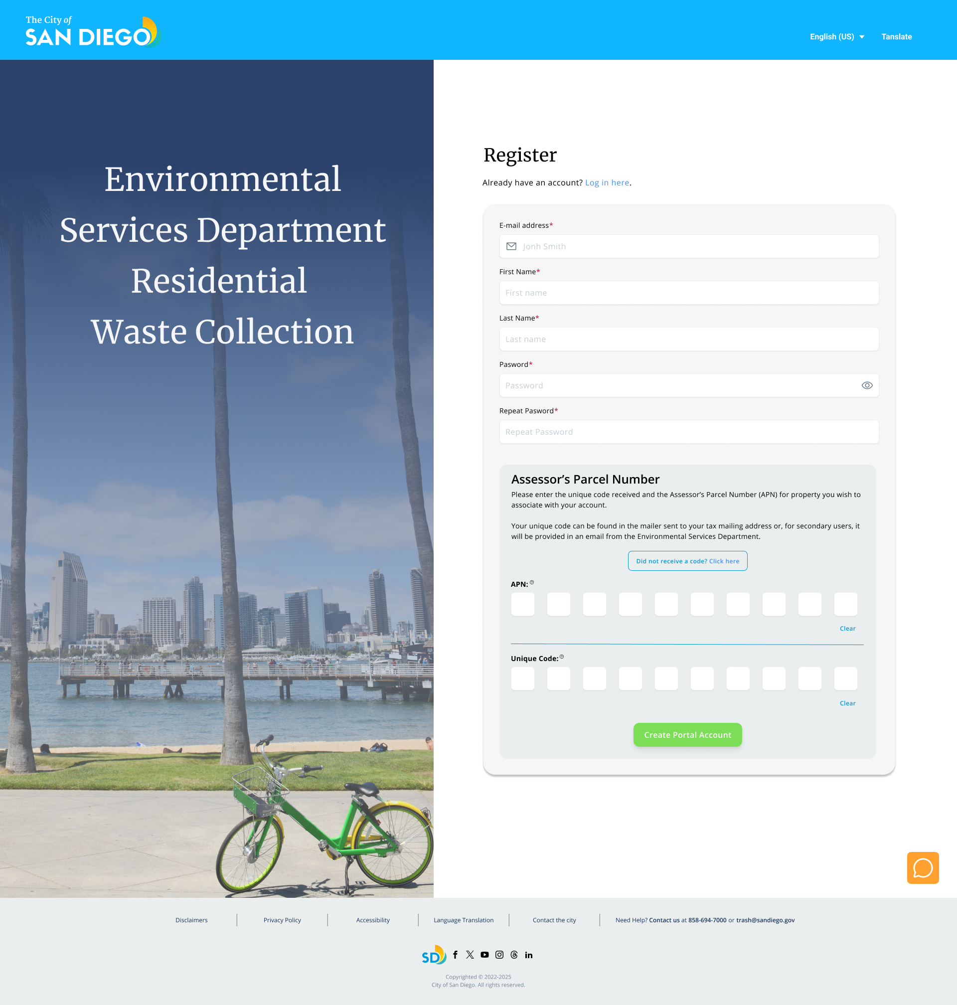
The existing San Diego waste portal: a static checkout form with no guided help and no way to ask a question.

Role & Team

This was a solo, self-directed capstone project for my AI for UX/UI Design certificate. I owned the project end-to-end: discovery research, persona development, competitive and heuristic reviews, wireframing, prototyping, moderated usability testing, and ethical and accessibility reviews.

I used AI deliberately at each stage, not as a novelty layer. ChatGPT and Perplexity supported research synthesis and competitive scans; Granola and Zoom transcription captured interviews; Figma, Figma Make, Lovable, Uizard, and UX Pilot supported wireframing and rapid prototyping.

Every AI output was treated as a first draft, not a finished insight, and checked against the actual interview recordings before informing a design decision.
ChatGPT
perplexity
Perplexity
granola logo
Granola
make logo
Make
UX pilot logo
UX Pilot
html to design logo
html. to. design
Figma Logo
Figma Make
Lovable logo
Lovable
UIzard
UIzard

Role & Team

This was a solo, self-directed capstone project for my AI for UX/UI Design certificate. I owned the project end-to-end: discovery research, persona development, competitive and heuristic reviews, wireframing, prototyping, moderated usability testing, and ethical and accessibility reviews.

I used AI deliberately at each stage, not as a novelty layer. ChatGPT and Perplexity supported research synthesis and competitive scans; Granola and Zoom transcription captured interviews; Figma, Figma Make, Lovable, Uizard, and UX Pilot supported wireframing and rapid prototyping.

Every AI output was treated as a first draft, not a finished insight, and checked against the actual interview recordings before informing a design decision.

Process & Research

I started by mapping the existing portal to real user needs. I conducted semi-structured interviews, about 20 minutes each, with three household types I expected to approach this decision differently: an eco-conscious family, a busy professional couple, and a retired household. I recorded and transcribed each session, used AI to synthesize themes, and kept the interpretation of what mattered to myself.

All three personas hit the same underlying wall: poor visual comparison of container sizes and prices, a bundling system with no clear rationale, and no way to translate “my household” into “this container.” But they wanted the fix delivered differently. The retired couple wanted the fewest possible steps and plain language. The busy professional wanted fast, confident answers rather than more explanation. The eco-conscious family wanted a calculator that reasoned from household size and habits rather than a flat, one-size-fits-all bundle. 
“It's cumbersome. There's too many steps. Too many pages... and not enough information.”
– Retired household participant
“Yes, I'll make the right decision because I know what I need, but not because they help me.”
– Busy professional household participant
That divergence shifted the concept from “add an FAQ” to “add a conversational layer.” A static FAQ can't adapt to someone who wants three quick answers and someone who wants to be guided through every option; a guided assistant can. Before building anything, I card-sorted the interview data by mental model, pattern, and category to test my assumptions against how residents think about this decision, rather than how the City's backend organizes containers.
Three research-based personas: Eco-Conscious Household, Busy Professional Household, and Retired Household, each with distinct wants, needs, and technology comfort.

Design Iterations

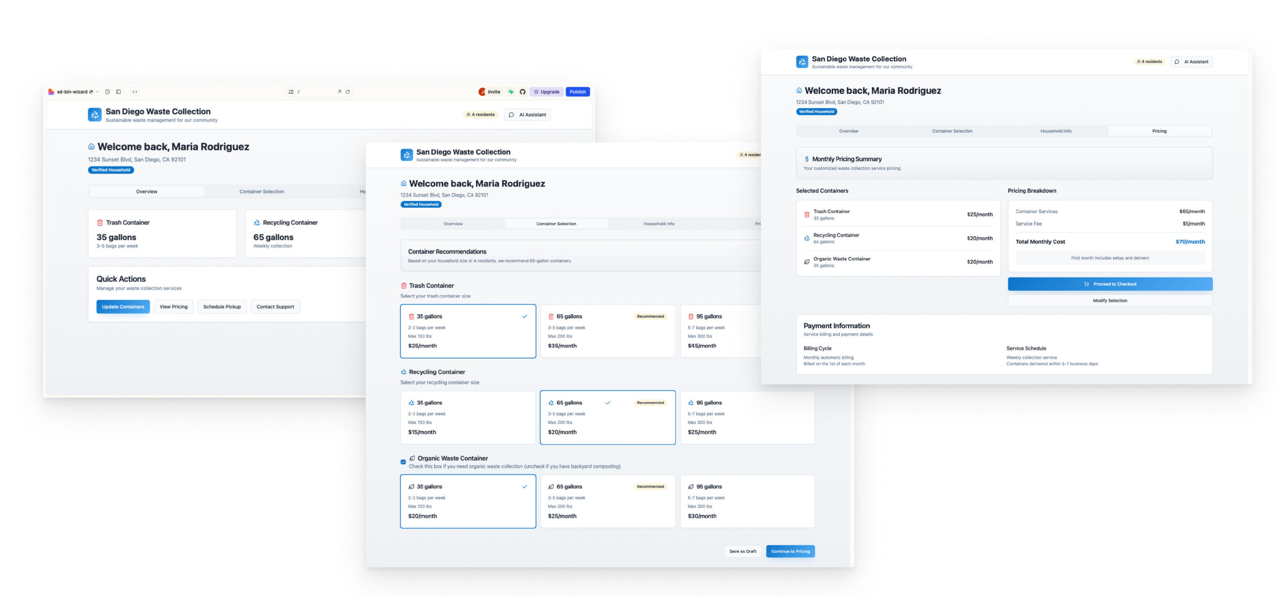
I built and tested two directions against the existing control dashboard: Option A, which layered a full AI assistant panel directly into the account dashboard, and Option B, which broke the decision into a guided, step-by-step flow (Dashboard, Services Calculator, Review Details, Billing Summary) with the assistant available throughout.
Early wireframe iterations built and compared across Lovable, Uizard, and Figma Make to pressure-test the guided-flow concept quickly.
A moderated usability round comparing both options against the control produced a split result, which taught me more than a unanimous one would have. Option B scored higher on clarity (4.8 out of 5), while Option A was preferred emotionally, largely because the dashboard felt more immediately familiar. Ninety percent of participants said both redesigns felt familiar compared to systems they already knew, a strong signal for Jakob's Law: users transfer expectations from other interfaces, so a redesign that still respects those conventions earns trust faster than one that reinvents the wheel.

A/B TESTING

A/B usability test: the existing control dashboard compared against two guided-flow concepts, Option A and Option B.
Testers also caught gaps I hadn't fully solved: the dollar amounts next to each container size were still ambiguous, the “Modify” action needed more visual prominence, and a few participants found the AI chat panel itself cluttered rather than helpful. That last point mattered most. It would have been easy to read a 4.8 clarity score as a finish line; instead, it told me the guided-flow structure was right but the chat surface still needed restraint, fewer visible options at once, and a clearer visual line between “browse on your own” and “ask a question.”

The Solution

The final concept combines the strongest parts of both tested directions. The portal opens to a guided, tabbed flow (Dashboard, Smart Waste Calculator, Review Details, Billing Summary) instead of a single dense form, so residents move through the decision in stages rather than confronting all of it at once, a direct application of progressive disclosure. A persistent AI assistant sits alongside the flow, not on top of it: a searchable FAQ for quick questions, and a chat entry point for anything the guided flow doesn't cover.

The assistant supports English, Spanish, Tagalog, Mandarin, Vietnamese, and Arabic, plus voice input, so language and literacy aren't a second barrier stacked on top of an already confusing civic process. Every screen keeps container size, price, and collection schedule visible together instead of split across pages, directly answering the “poor visual comparison” problem every persona raised independently. Typography, contrast, and screen-reader compatibility were built in from the start, not retrofitted, so residents using assistive technology aren't a secondary consideration.
High-fidelity prototype: the landing portal 
High-fidelity prototype: the verification portal

Outcome & Impact

This is a concept project, not a shipped product, so I can't report live adoption numbers. What the usability round did produce was concrete, honest signal rather than vague praise: a 4.8 out of 5 clarity score against the existing control experience, 90% of testers rating the redesigned flow as familiar despite it being new, and a specific, prioritized punch list, pricing clarity, modify visibility, and chat-panel restraint, instead of generic “users loved it” feedback. That's the kind of result I trust more, because it tells me exactly what to fix next and why, not just whether people smiled during the session.

REFLECTION

Working with AI across this project changed where I spent my time, not the standard I held the work to. AI accelerated the parts that used to eat a research week: synthesizing three interview transcripts, drafting multilingual copy, and generating rapid wireframe variations in Figma Make, Lovable, and Uizard so I could usability-test a direction the same week I thought of it. That freed up time for the part AI can't do: sitting with a retired couple who told me the process felt “cumbersome” and figuring out what that actually meant for a screen.

It also made me more careful, not less. AI-generated summaries can smuggle in bias or flatten real people into a stereotype if I don't push back on them, so I treated every AI output as a hypothesis to check against the actual interview recordings, not a finished insight. The split usability result, Option A winning on emotion and Option B winning on clarity, is exactly the kind of nuance a purely AI-synthesized summary would have been tempted to average away. If I extended this project, I'd re-test the chat-panel restraint fix with a larger sample than four participants, and pressure-test the multilingual flows with native speakers rather than relying on AI translation alone
“I redesigned a confusing civic form into a guided, multilingual AI-assisted experience that improves clarity, accessibility, and trust.”
– Jackie Lackenbacher