This project was executed when I worked a LightStream, a Division of Truist.
Client & Roles
LightStream, A Division of Truist
UX Designer
UI Designer
UX Designer
UI Designer
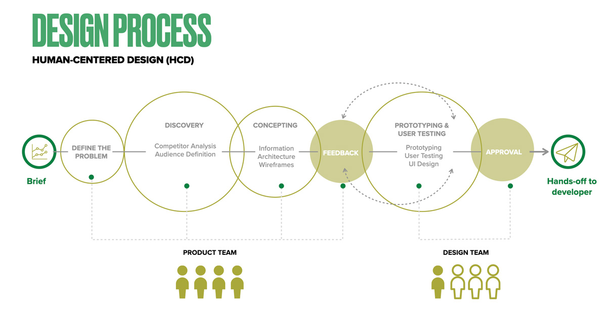
Contribution
Research
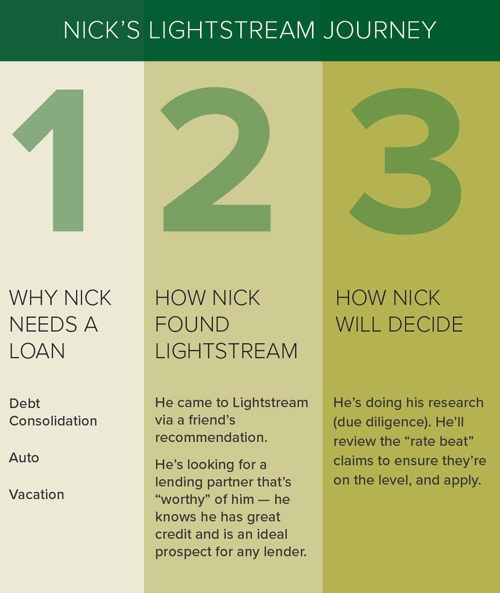
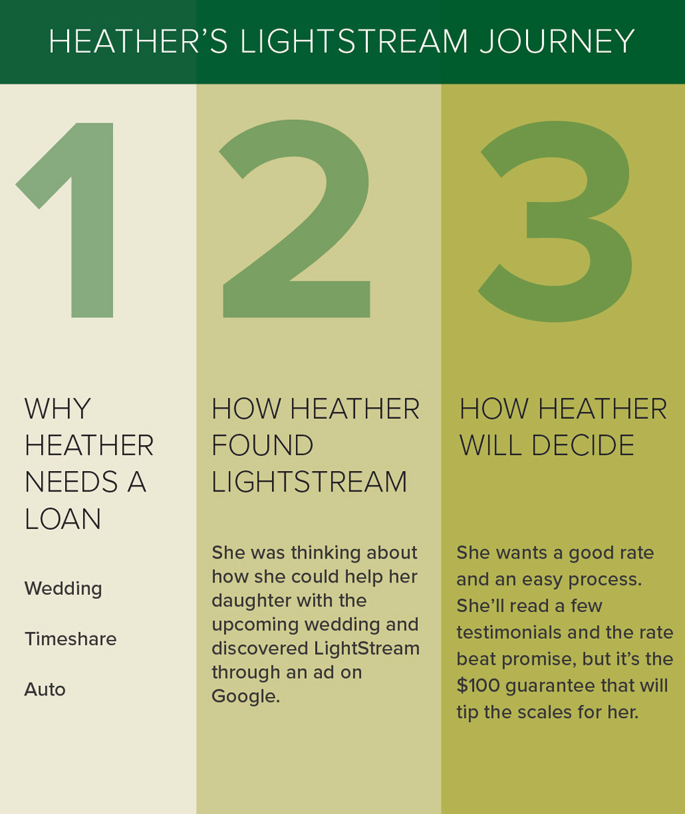
Proto-personas
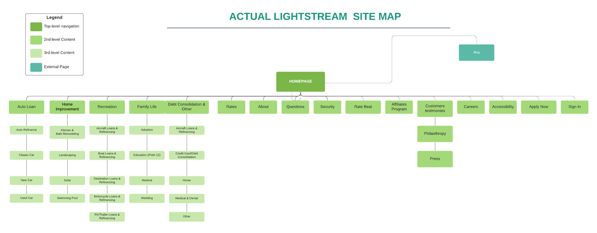
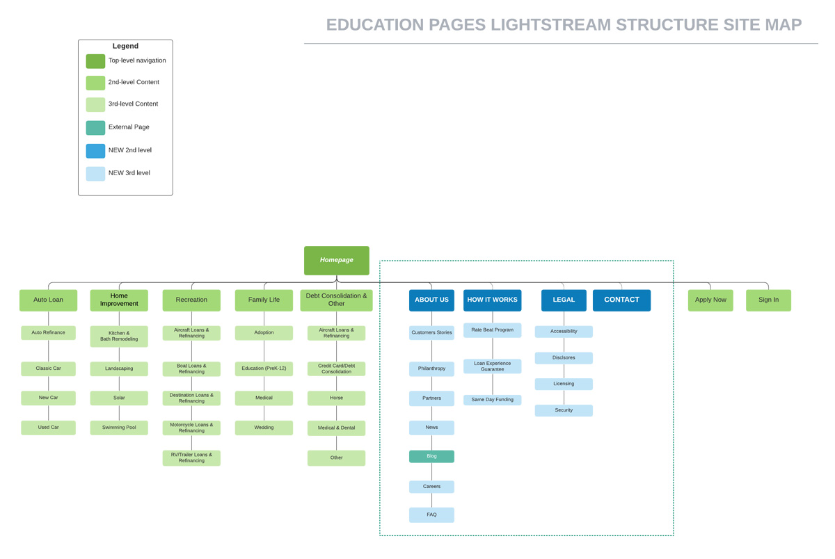
Journal Map
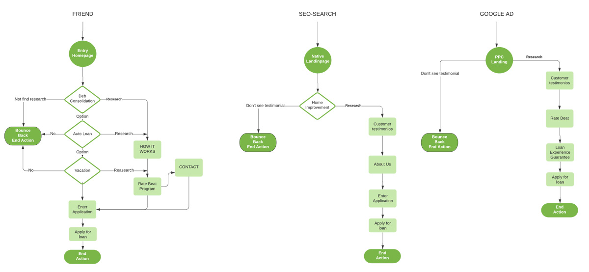
User Flow
Design System
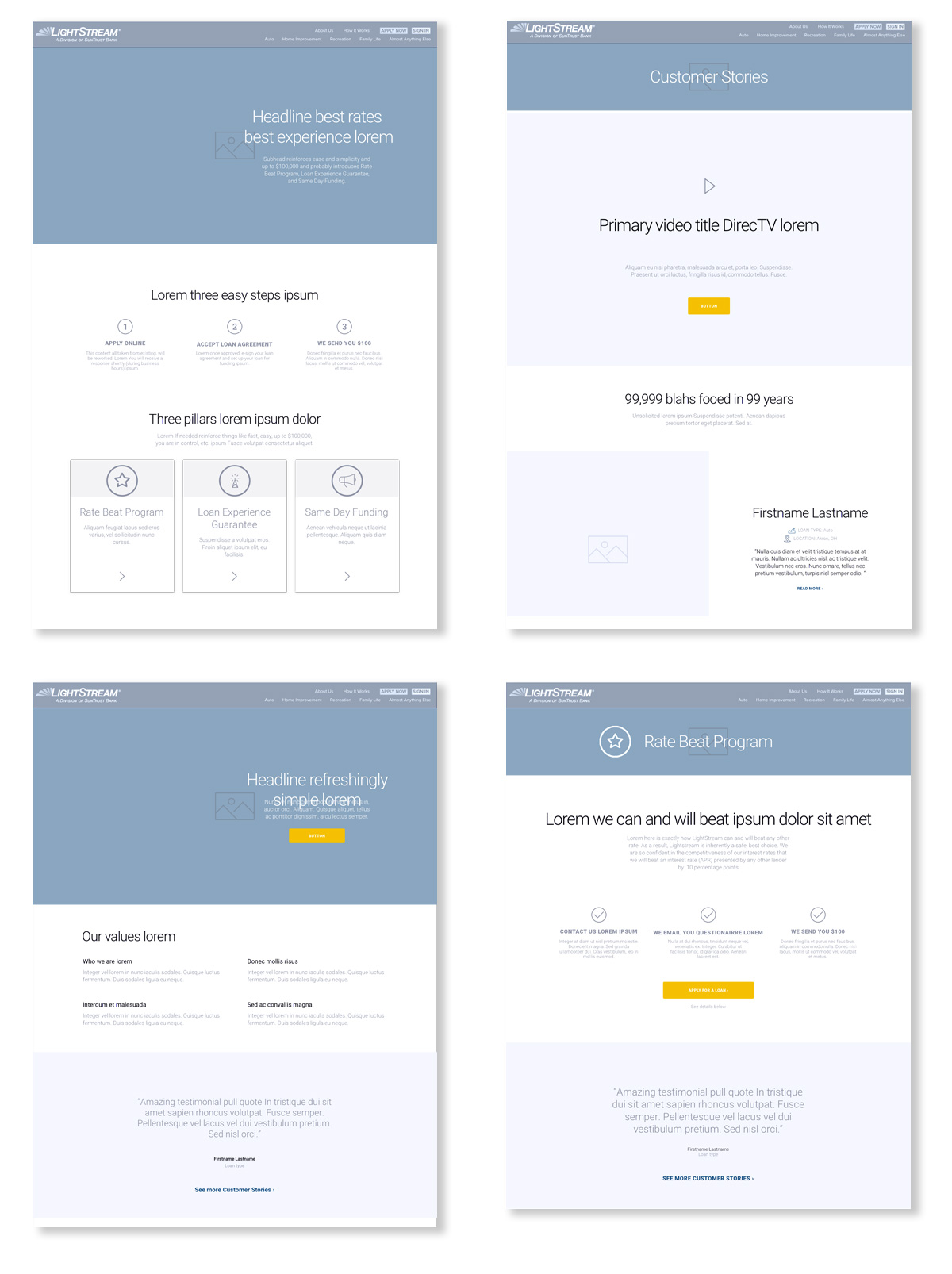
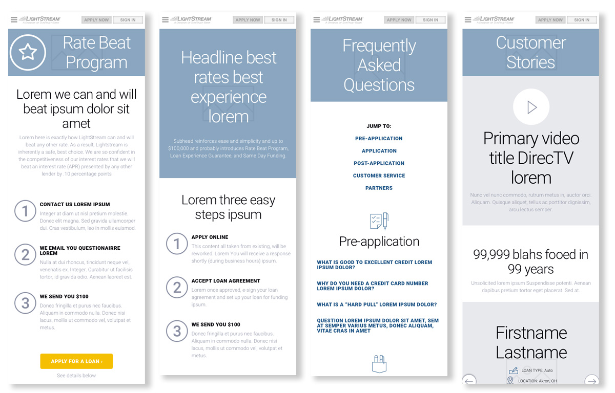
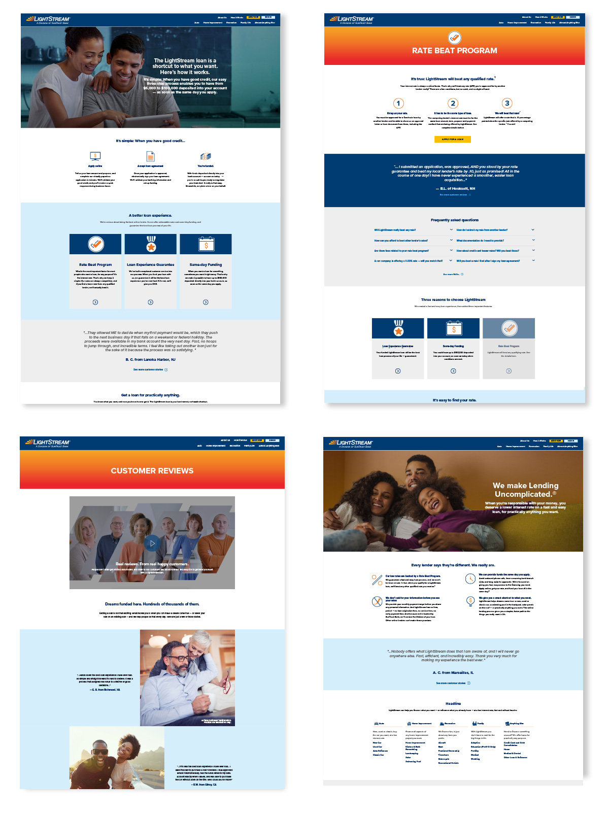
UI Design
Proto-personas
Journal Map
User Flow
Design System
UI Design
Tools
Sketch
Illustrator
Photoshop
Axure
Invision
Illustrator
Photoshop
Axure
Invision